- Looker
- Articles & Information
- Technical Tips & Tricks
- How to Find the Top Performers Over Time with Tabl...
- Subscribe to RSS Feed
- Mark as New
- Mark as Read
- Bookmark
- Subscribe
- Printer Friendly Page
- Report Inappropriate Content
- Article History
- Subscribe to RSS Feed
- Mark as New
- Mark as Read
- Bookmark
- Subscribe
- Printer Friendly Page
- Report Inappropriate Content
Looker will not be updating this content, nor guarantees that everything is up-to-date.
Starting in Looker 21.12, you can use Quick Calculations to perform common calculations on numeric fields that are in an Explore's data table without using Looker functions and operators when the Custom Fields Labs feature is enabled, and you have permission to use them.
This article is written with help and examples by Xin Bao, Customer Support Data Analyst.
A common question asked of analysts is how to find the top performers in a cohort over a specific amount of time. For example, "What are the 10 states with the highest total sales each day in the past month?"
You can leverage table calculations in Looker to effectively answer this type of question and clearly visualize it for end users. This article takes you through the steps using an e-commerce dataset containing user state data, sales data, and order data.
Solution
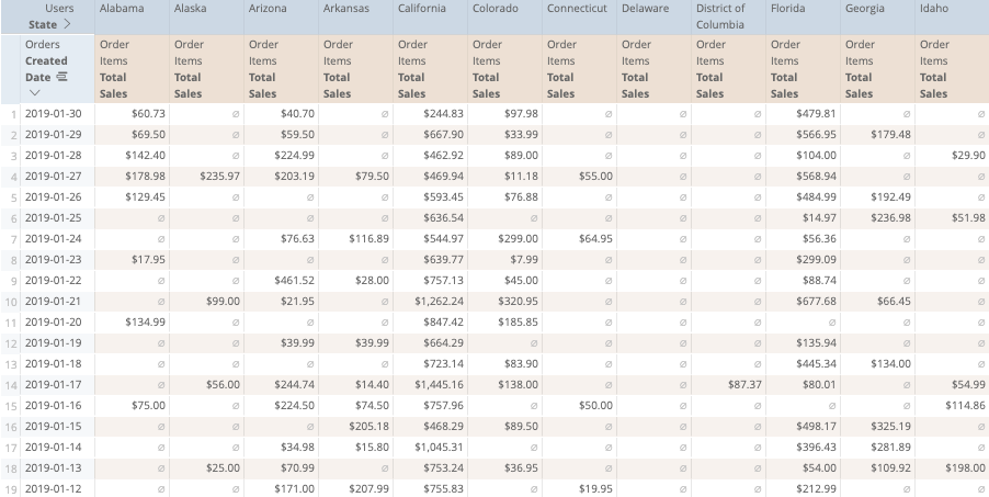
To begin, we will create an Explore with the fields necessary for performing the analysis. In this case, we will select the orders.created_date and users.state dimensions, along with the order_items.total_sales measure. We will also filter the results for the desired time frame (in this example, the month of January 2019). Finally, we will pivot on the users.state dimension:

To find the top 10 states for every day in the past month, we will use two functions — pivot_row() and large(). The large() function will give the nth biggest value of a list, and the pivot_row() function will generate the list of those values in each row.
When we have the tenth largest value of the list, we then compare the measure with the tenth largest value of the row. Next, we will create a logical if() statement to display only the values that are greater than or equal to the tenth largest value of the row and list. If a value does not meet this criteria, it will display a null.
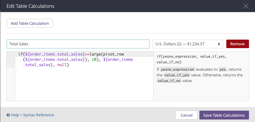
The final table calculation will look like the following, with the U.S. Dollars (2) format specified:

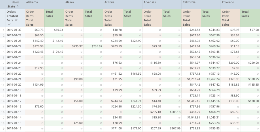
if(${order_items.total_sales}>=large(pivot_row(${order_items.total_sales}), 10), ${order_items.total_sales}, null)This table calculation can be adjusted as needed to fit other use cases. Replace the number 10 with the number of members of the highest-selling cohort you would like to see.With the addition of the table calculation, the Explore will look like this:

Visualizing the Results
Now that we have the table calculation, we are ready to visualize the results.
- First, make sure to hide the original measure (
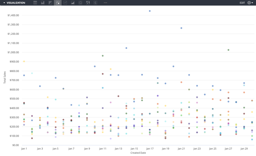
total_sales) from the visualization to display only the results from the table calculation. - Next, select the most appropriate visualization type. For this use case, we are using scatterplot.
- Switch off the Plot Null Values option in the visualization settings.
- Voila, now you can show the result!

Be aware of the column limit in Explores. Although Looker can display a maximum of 200 columns, you will begin seeing warnings when your table has more than 50 columns. For the best performance and to enhance the readability of the visualization, we always recommend fewer columns. For more details, check out Looker's row and column limit documentation page.

 Twitter