- Looker
- Articles & Information
- Technical Tips & Tricks
- Dynamic Rank in Visualization Using Parameter
- Subscribe to RSS Feed
- Mark as New
- Mark as Read
- Bookmark
- Subscribe
- Printer Friendly Page
- Report Inappropriate Content
- Article History
- Subscribe to RSS Feed
- Mark as New
- Mark as Read
- Bookmark
- Subscribe
- Printer Friendly Page
- Report Inappropriate Content
Looker will not be updating this content, nor guarantees that everything is up-to-date.
This article requires knowledge of Liquid variables — specifically, {% parameter parameter_name %}.
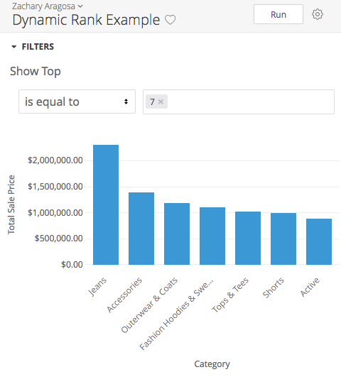
Using a LookML parameter called parameter, you can let users choose the top N ranking to display in visualizations on a dashboard. For example, if a user wanted to see the top seven product categories by total sale price, they could enter that value in a filter and the results would update dynamically:
The Process
To implement the above solution, we need to perform the following steps:
-
Add a
type: numberdimension and parameter to the appropriate LookML view (typically the same view that contains the fields you would like to visualize into rankings). The parameter will surface as a front-end filter for users who want to specify the desired number forrank, and the dimension will reflect that input to control how many data points are displayed in the visualization. The user's parameter value is captured with the{% parameter parameter_name %}syntax in thesqlparameter of thetype: numberdimension:parameter: max_rank {
type: number
}
dimension: rank_limit {
type: number
sql: {% parameter max_rank %} ;;
} -
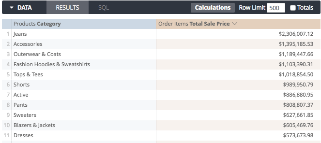
In an Explore, select the dimension you want to rank and the measure you want to sort by. In the following example, we have selected
products.categoryto be sorted byorder_items.total_sale_priceto see which categories have the most sales: -
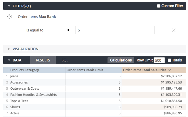
Next, add the
max_rankparameter as an Explore filter, and therank_limitdimension to the Explore table to group by: -
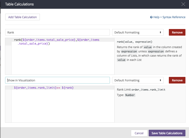
Next, create two table calculations to limit how many rows are displayed based on what the user has entered in the
max_rankfilter. The first table calculation, Rank, uses therankfunction, which outputs a ranking for each value oforder_items.total_sale_pricein the query when comparing it to the entire column oforder_items.total_sale_price. The second table calculation,show_in_visualization, is a simple statement that compares theranktable calculation value with therank_limitdimension. This calculation outputs Booleanyesornovalues, depending on whether a value meets the condition. - Then, hide both table calculations and the
rank_limitcolumn from the visualization so that only the desired fields appear. -
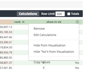
To complete adding the
rank_limitto the visualization, we use the Boolean output from theshow_in_visualizationtable calculation to hide the values from the visualization that do not meet the condition. To do this, select Hide "No"s from Visualization from theshow_in_visualizationtable calculation's gear menu: -
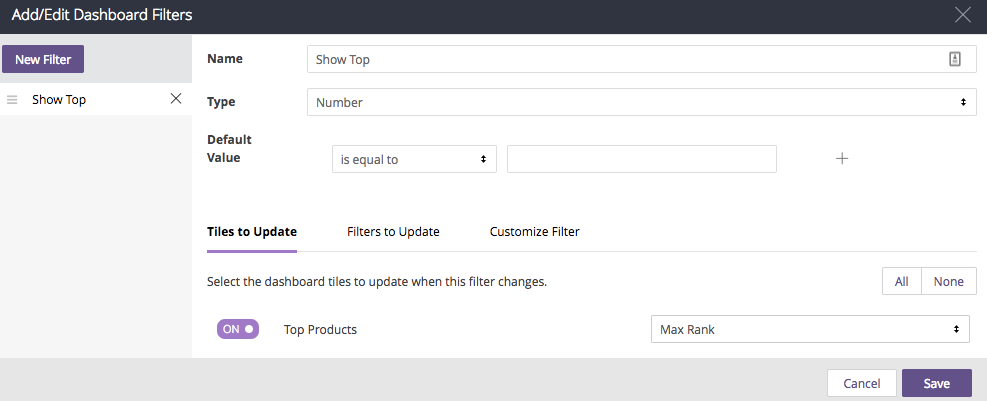
Finally, add the visualization to a dashboard, and add a filter to the dashboard, linked to the
max_rankparameter:

 Twitter