This website uses Cookies. Click Accept to agree to our website's cookie use as described in our Privacy Policy. Click Preferences to customize your cookie settings.
Turn on suggestions
Auto-suggest helps you quickly narrow down your search results by suggesting possible matches as you type.
Showing results for
- Looker
- Articles & Information
- Technical Tips & Tricks
- Advanced LookML - Cohort and Retention Analysis
Topic Options
- Subscribe to RSS Feed
- Mark as New
- Mark as Read
- Bookmark
- Subscribe
- Printer Friendly Page
- Report Inappropriate Content

 LinkedIn
 Twitter
LookerExperts
Staff
Topic Options
- Article History
- Subscribe to RSS Feed
- Mark as New
- Mark as Read
- Bookmark
- Subscribe
- Printer Friendly Page
- Report Inappropriate Content
5
0
10.3K
Knowledge Drop
Last tested: Jun 24, 2019
What is a Cohort Analysis?
Read this data tutorial here (5 minutes) and check out this introduction video to learn about the fundamentals about cohort analysis:
What’s the point of Cohort Analysis?
The goal of a cohort analysis is to analyse the performance of cohorts relative to each other and over time. Once we understand how different cohorts are performing, we can then take action.
What exactly is a “cohort”?
In a nutshell, a cohort is simply a subset of users grouped by common characteristics. In the context of BI and SaaS, a cohort usually refers to a subset of users specifically segmented by some key date (i.e. the first time they visit your website, the date they perform a specific action, the date they made their first purchase/registered, etc.). Based on this key date, we can then group users together by the week / month, or whatever timeframe is useful for the business.
How do we do this?
By grouping users together by some key date, we can then compare different cohorts at the same stage in their lifecycle. Let’s look at a common example (taken from the link above).
Let’s say you run an ecommerce store selling widgets. You query your data and see monthly revenue is continuing to rise every year. See the graph below:

All groovy right? Well, what if we know as a business, that the total lifetime value of a customer is highly dependent on their sales during their first month as a customer. Let’s add this extra measure to compare the total sales by new users to the total revenue for each month:

The results don’t look that great anymore. We can see that new user revenue is decreasing over time. This means that the new users that are being acquired now are less valuable than in the past!
Based on this chart, we can see that the revenue growth from older cohorts is masking the fact that the value of newer cohorts has been decreasing over time. We now know ahead of time that while revenue is continuing to rise, there is a major issue with our new users acquired in the past 6 months, and we can investigate further from there.
How do we use these analytical patterns?
Cohort analysis is a very powerful tool to understand seasonality, customer lifecycle and the long term health of a business. Running a cohort analysis is one of the simplest ways to run an experiment to see how certain aspects of the business is performing over time (think time-bound campaigns). The end goal is that after the analysis, we can draw insights and take action.
What are some of the commonly used terms?
- Cohort type: the key date that’s used to group users together; e.g. Acquisition date, Sign up date, User created date, First session date, etc.
- Cohort size: how you define cohorts, i.e. by day, by week, or by month. For instance, if you select by month, then each cohort represents the users acquired in a particular month
- Date range: the window of time that you want to examine (e.g. the last 12 complete months)
- Metric: the aggregations used to compare cohorts. Some common examples are:
- Total Users / Total Active Users / Percent Users Active
- Total Amount Spend / Spend Per User / Spend Per Active User
- Lifetime Value / Acquisition Cost
- Retention Rate / Churn Rate
Moving to Looker
Let’s say you work for an up-and-coming news website and wanted to track user retention over time. You have generated many Views and Fields Looker, but more importantly, you have created this Explore and these three Fields:
explore: events {

join: users {

type: left_outer

sql_on: ${events.user_id} = ${users.id} ;;

relationship: many_to_one

}

}
view: events {

…

dimension_group: created {

type: time

timeframes: [...]

sql: ${TABLE}.created_at ;;

}

}
view: users {

…

dimension_group: created {

type: time

timeframes: [...]

sql: ${TABLE}.created_at ;;

}
measure: count {

type: count

}

}
Believe it or not, this is actually all you need to begin to cohorting users into groups. We can now see if the latest marketing campaign is successful in acquiring the target audience that continue to return to your website. All we need to do is create one additional dimension which calculates the difference between the user timestamp and event timestamp:
dimension_group: return_after_user_created {

type: duration

sql_start: ${users.created_raw} ;;

sql_end: ${created_raw} ;;

}
This duration type dimension will essentially run a SQL like statement like so:
DATE_DIFF(${created_date},${users.created_date}, INTERVAL)
From here, we can jump to the Explore and simply select these fields. This type of analysis is referred to as an impact plot:
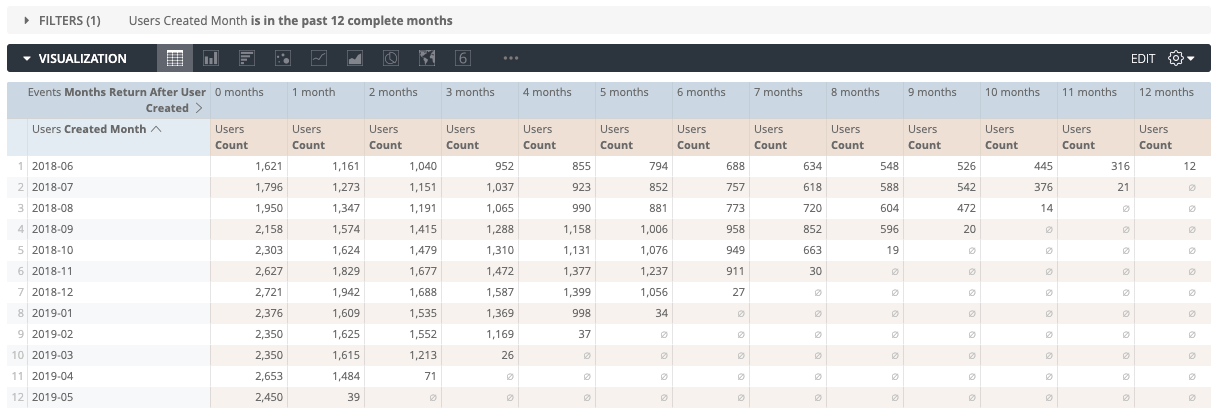
Impact plots are the most common visualization type used for cohorts. How do we actually make sense of this?
On the Y-axis we have the Users Created Month in which the users were acquired (each month is a cohort of users). The X-axis has the number of months after the user was created (0 months is the first month, all the way up to 12 months). Each square represents the distinct count of users that were active (i.e. had an event during that time period).
More Visualizations
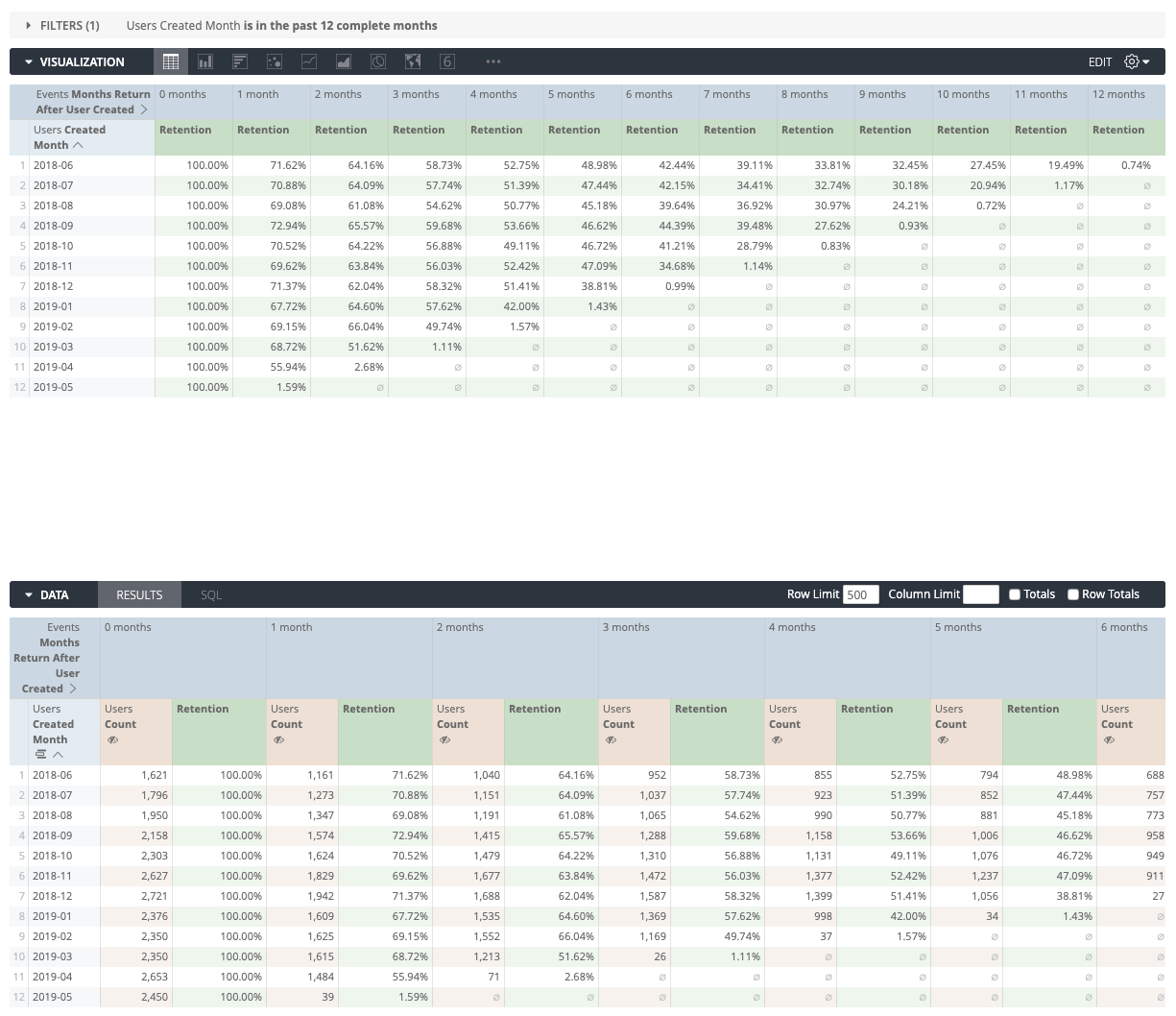
It’s great to know our absolute user count by month, but what would actually be even better is to know what percentage of each cohort is being retained over time. We can achieve this via a simple table calculation to compare each value to first pivoted column (the total cohort size):
${users.count}/pivot_index(${users.count},1)
Which will give us some values which we can compare to each other:
We don’t always need to cohort by the user created date either, we can run similar analysis on location:

What if we don’t want to use Table Calculations?
A different approach to cohort analysis is to use derived tables in place of Table Calculations. One of the key benefits of using derived tables is that it can be modeled in a flexible state (via templated filters) and made readily available for all users, without the expectation that end users will need to understand how to correctly define Table Calculation formulas. In the long term, this will help organizations stay on the same page.
This example below was inspired by this cohort analysis block:
explore: users {

…

join: user_cohort_size {

sql_on: ${user_cohort_size.created_month} = ${users.created_month} ;;

relationship: many_to_one

}

}
view: user_cohort_size {

derived_table: {

explore_source: users {

column: created_month {field: users.created_month_for_join }

column: cohort_size { field: users.count }

bind_filters: {

to_field: users.age

from_field: users.age

}

bind_filters: {

to_field: users.state

from_field: users.state

}

}

}
dimension: created_month { primary_key: yes }
dimension: cohort_size { type: number }

measure: total_revenue_over_total_cohort_size {

type: number

sql: ${order_items.total_sales} / NULLIF(${total_cohort_size},0) ;;

value_format_name: usd

}

measure: total_cohort_size {

type: sum

sql: ${cohort_size} ;;

}

}
If you are unfamiliar with NDTs, please note that the SQL generated will be the following:
SELECT

TO_CHAR(created_at,'YYYY-MM') AS created_month

, COUNT(*) as cohort_size

FROM users

WHERE {% condition users.age %} age {% endcondition %}

AND {% condition users.state %} state {% endcondition %}

GROUP BY 1
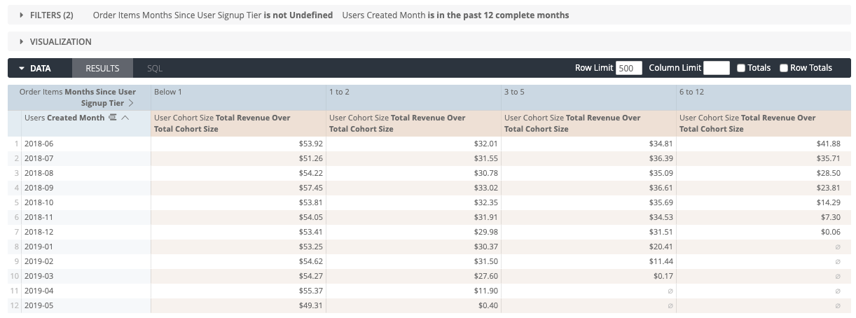
Because we now have the cohort_size defined as a dimension, we can do some really cool things like find out what total revenue / total cohort size is, and begin to slice and dice the data. Here’s an example where we leverage a tier type dimension to bucket months since user sign up:
The last visualization we will run through is the Layer Cake. This is useful for examining absolute (total) values and the breakdown by cohort over time. Here’s an example showing Total Sales by the User Created Month cohort over time:
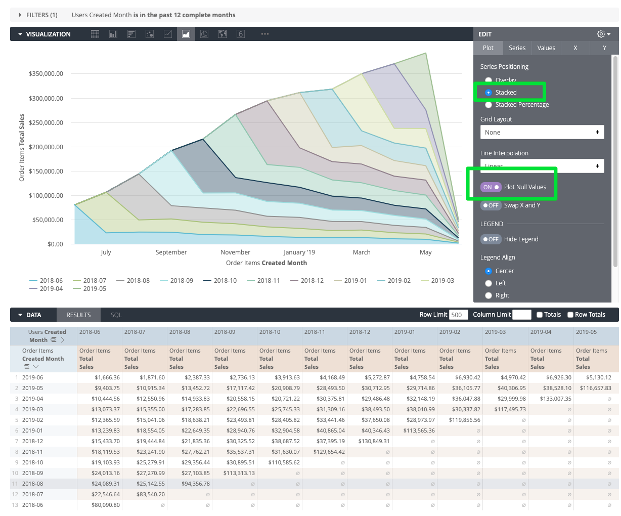
This time, we’ve swapped the pivoted fields, so that the series in the visualization is the User’s Created Month. Also make sure to stack the series and plot the null values.
For inspiration of all the various types of visualizations that is being used across businesses, check out some of the examples here.
This content is subject to limited support.
Topic Labels