- Looker
- Looker Forums
- Modeling
- Create Looker Sankey Diagram
- Subscribe to RSS Feed
- Mark Topic as New
- Mark Topic as Read
- Float this Topic for Current User
- Bookmark
- Subscribe
- Mute
- Printer Friendly Page
- Mark as New
- Bookmark
- Subscribe
- Mute
- Subscribe to RSS Feed
- Permalink
- Report Inappropriate Content
- Mark as New
- Bookmark
- Subscribe
- Mute
- Subscribe to RSS Feed
- Permalink
- Report Inappropriate Content
Hi there,
I’d like to create a Sankey Diagram to show flow. Data will be like page views. Users will be directed to 1st page, and then to other pages.
Data:
timestamp, user_id, page_name
How should I properly create Sankey diagram? I found very limited sources online.
Need to know:
1). Is it necessary to prepare data in certain form? If yes, what form does it have to be?
2). How to prepare in LookML
Thanks!
- Mark as New
- Bookmark
- Subscribe
- Mute
- Subscribe to RSS Feed
- Permalink
- Report Inappropriate Content
- Mark as New
- Bookmark
- Subscribe
- Mute
- Subscribe to RSS Feed
- Permalink
- Report Inappropriate Content
You can use the following:
looker/custom_visualizations_v2
Contribute to looker/custom_visualizations_v2 development by creating an account on GitHub.
Unfortunately I don’t think there is a lot of active development with this script. It would be awesome if somebody created a new version that works with pivots etc.
- Mark as New
- Bookmark
- Subscribe
- Mute
- Subscribe to RSS Feed
- Permalink
- Report Inappropriate Content
- Mark as New
- Bookmark
- Subscribe
- Mute
- Subscribe to RSS Feed
- Permalink
- Report Inappropriate Content
Hi Dawid,
Thanks for the resources. I have checked these two articles already, however, i’m still not sure how to create diagram.
I feel the same that there is not a lot of development. So few articles talking about this.
- Mark as New
- Bookmark
- Subscribe
- Mute
- Subscribe to RSS Feed
- Permalink
- Report Inappropriate Content
- Mark as New
- Bookmark
- Subscribe
- Mute
- Subscribe to RSS Feed
- Permalink
- Report Inappropriate Content
I managed to get a diagram working but don’t think we will actively use it because of lack of working with pivots, tooltips, highlighting whole path across multiple nodes etc.
How far did you get?
- Mark as New
- Bookmark
- Subscribe
- Mute
- Subscribe to RSS Feed
- Permalink
- Report Inappropriate Content
- Mark as New
- Bookmark
- Subscribe
- Mute
- Subscribe to RSS Feed
- Permalink
- Report Inappropriate Content
Hi!
Here is a quick example of a Sankey diagram setup.
In this example, we are looking at where people who leave San Francisco move to:
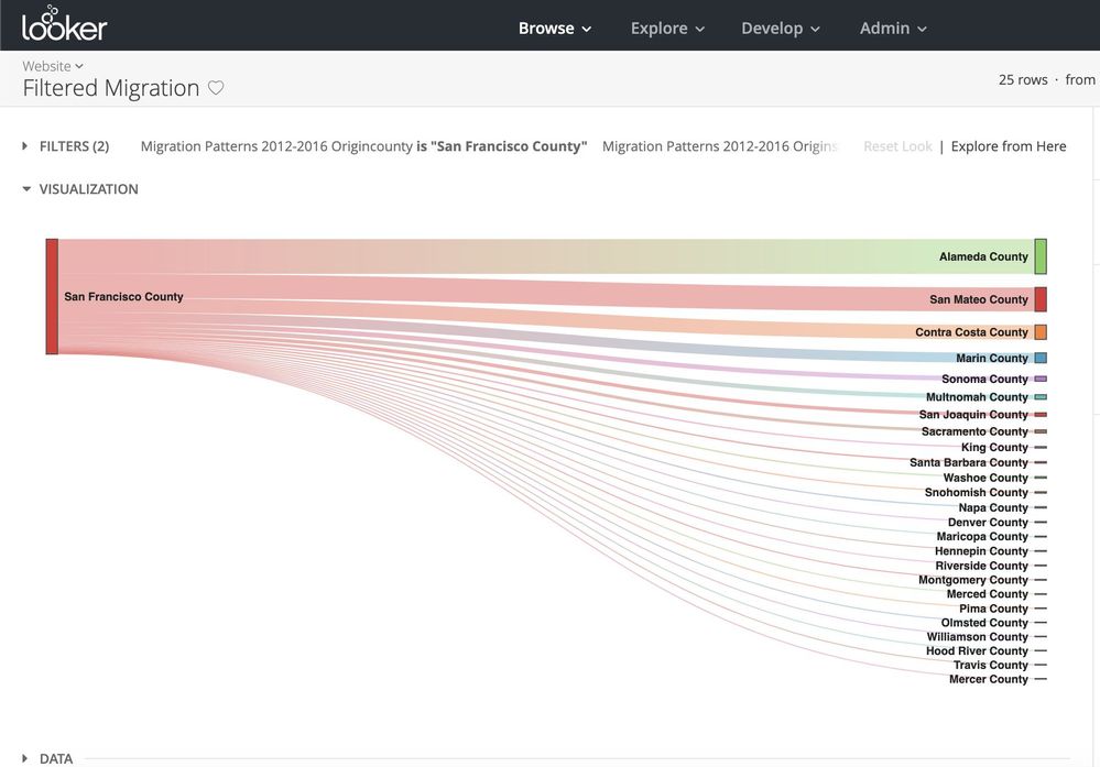
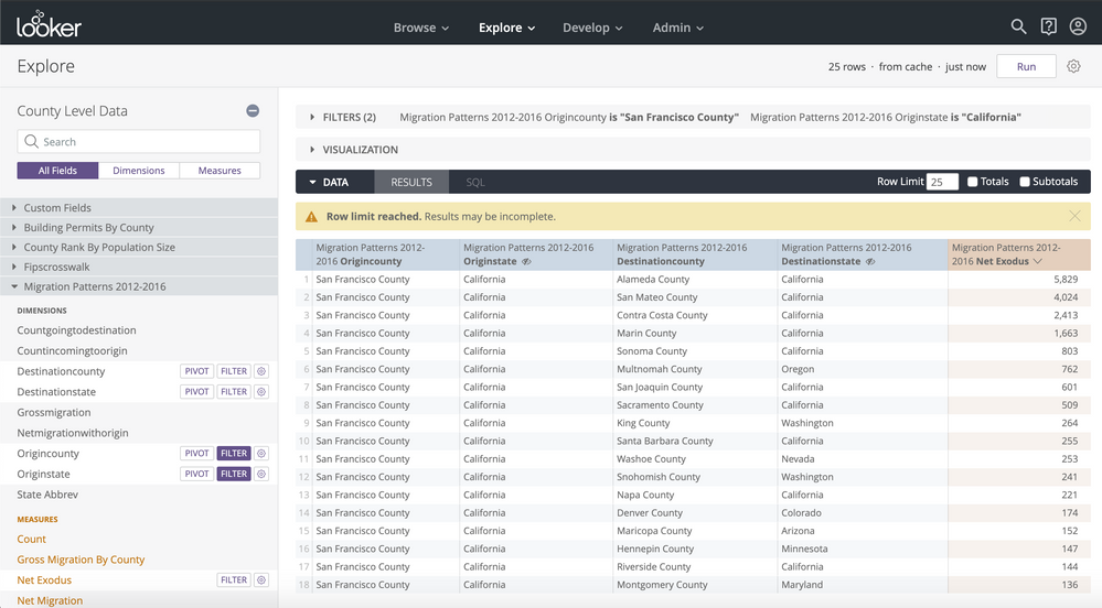
To get a Sankey diagram working, you need at least two dimensions and only one measure. For the migration example above, while my explore has four dimensions selected, I am hiding two of them from the visualization:
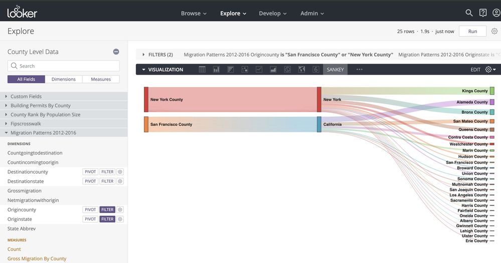
You can add more dimensions, based on what makes sense about the relationships you are trying to define. In this case, I added migration data from New York County, NY to see the common destinations people leaving New York and San Francisco go to. In this case, I unhid the “origin state” dimension so that now there are three dimensions (origin county, origin state, and destination county)
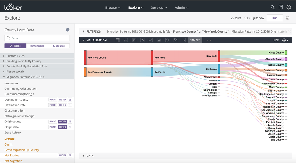
One thing to be aware of is that the Sankey reflects the order of dimensions as arranged in your “Data” tab. So if you want to see the flow from origin county -> state to destination state-> county, you will need to arrange your fields accordingly:
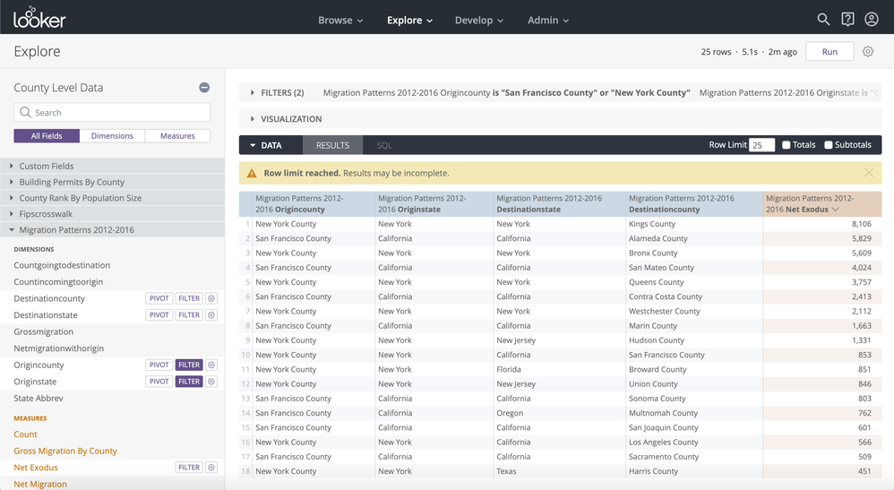
If you would like more options for configuring Sankey diagrams and are comfortable with javascript and Typescript, we do make the visualizations available in the public repo that @Dawid linked above, so you can fork it and modify them as you see fit.
- Mark as New
- Bookmark
- Subscribe
- Mute
- Subscribe to RSS Feed
- Permalink
- Report Inappropriate Content
- Mark as New
- Bookmark
- Subscribe
- Mute
- Subscribe to RSS Feed
- Permalink
- Report Inappropriate Content
Yeah. I got the graph. But couldn’t find much options to edit the data. Please help here. If you are using multiple stages, then multiple columns will appear and hence it is becoming difficult to identify which stage belongs to what. Can we just have column header? Requesting your support in this problem
- Mark as New
- Bookmark
- Subscribe
- Mute
- Subscribe to RSS Feed
- Permalink
- Report Inappropriate Content
- Mark as New
- Bookmark
- Subscribe
- Mute
- Subscribe to RSS Feed
- Permalink
- Report Inappropriate Content
Mihir, could you maybe provide a diagram of what you’d like to see?
Our Sankey custom viz example requires a pretty specific configuration, which Shingi laid out above— If you’re a JS whiz, you could modify it to fit your needs, but I don’t think you’ll get much flexibility out of it as is.
- Mark as New
- Bookmark
- Subscribe
- Mute
- Subscribe to RSS Feed
- Permalink
- Report Inappropriate Content
- Mark as New
- Bookmark
- Subscribe
- Mute
- Subscribe to RSS Feed
- Permalink
- Report Inappropriate Content
Hi Izzy,
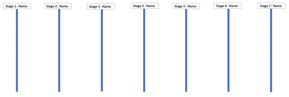
Similar to that added image can we just add the stage name above all the columns we usually have in the Sakey Chart. Maybe for the simplicity purpose, we can take column names from the database as stage names. Please let us know if this is feasible.
- Mark as New
- Bookmark
- Subscribe
- Mute
- Subscribe to RSS Feed
- Permalink
- Report Inappropriate Content
- Mark as New
- Bookmark
- Subscribe
- Mute
- Subscribe to RSS Feed
- Permalink
- Report Inappropriate Content
Ah, I get it. That functionality doesn’t exist now, but wouldn’t be too hard to add to the custom viz if you do know some javascript. If anyone else feels like giving it a shot, here is the link to the visualization on github: https://github.com/looker/custom_visualizations_v2/tree/master/src/examples/sankey. Would love to see some work done on it!
- Mark as New
- Bookmark
- Subscribe
- Mute
- Subscribe to RSS Feed
- Permalink
- Report Inappropriate Content
- Mark as New
- Bookmark
- Subscribe
- Mute
- Subscribe to RSS Feed
- Permalink
- Report Inappropriate Content
Hi @Ashton_Du,
I hope you are doing well, check my Sankey diagram created in Excel to visualize user behavior.
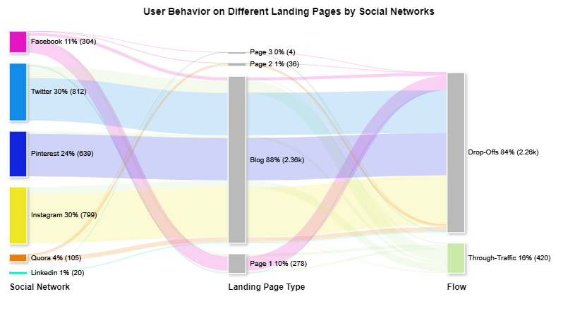
I used ChartExpo™ , It is both an Excel and Google Sheets plugin for data visualization.
There is no requirement of coding skills.
Try it for Free:
ChartExpo™ for Excel & Office 365
ChartExpo for Google Sheets
Sharing a video to watch how easy to create Sankey diagram in Google Sheets and Excel.
All the Best!
- Mark as New
- Bookmark
- Subscribe
- Mute
- Subscribe to RSS Feed
- Permalink
- Report Inappropriate Content
- Mark as New
- Bookmark
- Subscribe
- Mute
- Subscribe to RSS Feed
- Permalink
- Report Inappropriate Content
To create a Sankey Diagram for page views in LookML:
Data Format: Your data should have columns for timestamp, user_id, and page_name. You'll need to aggregate it to track user flow.
Data Preparation in LookML: You can prepare the data in LookML by writing LookML models and explores to extract and organize the required data. Ensure you have dimensions for timestamp, user_id, and page_name in your LookML model.
Once your data is structured properly in LookML, you can use Looker's visualization tools to create the Sankey Diagram.
-
access grant
6 -
actionhub
1 -
actions
8 -
Admin
7 -
Analytics Block
25 -
API
25 -
Authentication
2 -
bestpractice
7 -
BigQuery
69 -
blocks
11 -
Bug
60 -
cache
7 -
case
12 -
Certification
2 -
chart
1 -
cohort
5 -
connection
14 -
connection database
4 -
content access
2 -
content-validator
5 -
count
5 -
custom dimension
5 -
custom field
11 -
custom measure
13 -
customdimension
8 -
Customizing LookML
114 -
Dashboards
144 -
Data
7 -
Data Sources
3 -
data tab
1 -
Database
13 -
datagroup
5 -
date-formatting
12 -
dates
16 -
derivedtable
51 -
develop
4 -
development
7 -
dialect
2 -
dimension
46 -
done
9 -
download
5 -
downloading
1 -
drilling
28 -
dynamic
17 -
embed
5 -
Errors
16 -
etl
2 -
explore
58 -
Explores
5 -
extends
17 -
Extensions
9 -
feature-requests
6 -
filter
220 -
formatting
13 -
git
19 -
googlesheets
2 -
graph
1 -
group by
7 -
Hiring
2 -
html
19 -
ide
1 -
imported project
8 -
Integrations
1 -
internal db
2 -
javascript
2 -
join
16 -
json
7 -
label
6 -
link
17 -
links
8 -
liquid
154 -
Looker Studio Pro
1 -
looker_sdk
1 -
LookerStudio
3 -
lookml
859 -
lookml dashboard
20 -
LookML Foundations
52 -
looks
33 -
manage projects
1 -
map
14 -
map_layer
6 -
Marketplace
2 -
measure
22 -
merge
7 -
model
7 -
modeling
26 -
multiple select
2 -
mysql
3 -
nativederivedtable
9 -
ndt
6 -
Optimizing Performance
28 -
parameter
70 -
pdt
35 -
performance
11 -
periodoverperiod
16 -
persistence
2 -
pivot
3 -
postgresql
2 -
Projects
7 -
python
2 -
Query
3 -
quickstart
5 -
ReactJS
1 -
redshift
10 -
release
18 -
rendering
3 -
Reporting
2 -
schedule
5 -
schedule delivery
1 -
sdk
5 -
singlevalue
1 -
snowflake
16 -
sql
219 -
system activity
3 -
table chart
1 -
tablecalcs
53 -
tests
7 -
time
8 -
time zone
4 -
totals
7 -
user access management
3 -
user-attributes
9 -
value_format
5 -
view
24 -
Views
5 -
visualizations
166 -
watch
1 -
webhook
1 -
日本語
3
- « Previous
- Next »

 Twitter