- Looker
- Looker Forums
- Modeling
- Multiple values comparison with arrow
- Subscribe to RSS Feed
- Mark Topic as New
- Mark Topic as Read
- Float this Topic for Current User
- Bookmark
- Subscribe
- Mute
- Printer Friendly Page
- Mark as New
- Bookmark
- Subscribe
- Mute
- Subscribe to RSS Feed
- Permalink
- Report Inappropriate Content
- Mark as New
- Bookmark
- Subscribe
- Mute
- Subscribe to RSS Feed
- Permalink
- Report Inappropriate Content
Hello,
How I can show arrows in the multiple values comparison viz?
I have table like this,

for the “percent change month over month column”, I would like to show the values with arrows like these.


I know this is done easily in the single value comparison. Can we do the same thing for the multiple value comparison? Does anybody have a trick?
Thank you,
- Labels:
-
Dashboards
-
lookml
-
sql
-
visualizations
- Mark as New
- Bookmark
- Subscribe
- Mute
- Subscribe to RSS Feed
- Permalink
- Report Inappropriate Content
- Mark as New
- Bookmark
- Subscribe
- Mute
- Subscribe to RSS Feed
- Permalink
- Report Inappropriate Content
I don’t believe this is currently possible but I’d also love to see this feature added for Multiple Values visualizations.
- Mark as New
- Bookmark
- Subscribe
- Mute
- Subscribe to RSS Feed
- Permalink
- Report Inappropriate Content
- Mark as New
- Bookmark
- Subscribe
- Mute
- Subscribe to RSS Feed
- Permalink
- Report Inappropriate Content
In my use case, positive values were bad, so they’re red in the color coding below, but here are the two iterations of the colored arrow that I used:
Using LookML
You can use the html parameter in a dimension for the formatting:
  dimension: change_7_day_rolling_average {
    type: number
    value_format_name: percent_0
    sql: (${daily_volume} * 1.0 / ${7_day_rolling_average}) - 1 ;;
    html: {% if value > 0 %}
         <p style="color: #990000">▲  {{ rendered_value }}</p>
      {% elsif value < 0 %}
        <p style="color: #009900">▼  {{ rendered_value }}</p>
      {% else %}
        <p style="color: #000000">{{ rendered_value }}</p>
      {% endif %} ;;
  }
Using Table Calculations
In the table calculations, make a field for your value and set the Formatting to “Custom...” and enter this string:
"▲ "+0%; "▼ "-0%; 0
which gives you this in the Data Results:

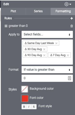
You can then set the conditional formatting in the visualization menu for red and green

-
access grant
6 -
actionhub
1 -
Actions
8 -
Admin
7 -
Analytics Block
25 -
API
25 -
Authentication
2 -
bestpractice
7 -
BigQuery
69 -
blocks
11 -
Bug
60 -
cache
7 -
case
12 -
Certification
2 -
chart
1 -
cohort
5 -
connection
14 -
connection database
4 -
content access
2 -
content-validator
5 -
count
5 -
custom dimension
5 -
custom field
11 -
custom measure
13 -
customdimension
8 -
Customizing LookML
114 -
Dashboards
144 -
Data
7 -
Data Sources
3 -
data tab
1 -
Database
13 -
datagroup
5 -
date-formatting
12 -
dates
16 -
derivedtable
51 -
develop
4 -
development
7 -
dialect
2 -
dimension
46 -
done
9 -
download
5 -
downloading
1 -
drilling
28 -
dynamic
17 -
embed
5 -
Errors
16 -
etl
2 -
explore
58 -
Explores
5 -
extends
17 -
Extensions
9 -
feature-requests
6 -
filter
220 -
formatting
13 -
git
19 -
googlesheets
2 -
graph
1 -
group by
7 -
Hiring
2 -
html
19 -
ide
1 -
imported project
8 -
Integrations
1 -
internal db
2 -
javascript
2 -
join
16 -
json
7 -
label
6 -
link
17 -
links
8 -
liquid
154 -
Looker Studio Pro
1 -
looker_sdk
1 -
LookerStudio
3 -
lookml
859 -
lookml dashboard
20 -
LookML Foundations
52 -
looks
33 -
manage projects
1 -
map
14 -
map_layer
6 -
Marketplace
2 -
measure
22 -
merge
7 -
model
7 -
modeling
26 -
multiple select
2 -
mysql
3 -
nativederivedtable
9 -
ndt
6 -
Optimizing Performance
28 -
parameter
70 -
pdt
35 -
performance
11 -
periodoverperiod
16 -
persistence
2 -
pivot
3 -
postgresql
2 -
Projects
7 -
python
2 -
Query
3 -
quickstart
5 -
ReactJS
1 -
redshift
10 -
release
18 -
rendering
3 -
Reporting
2 -
schedule
5 -
schedule delivery
1 -
sdk
5 -
singlevalue
1 -
snowflake
16 -
sql
219 -
system activity
3 -
table chart
1 -
tablecalcs
53 -
tests
7 -
time
8 -
time zone
4 -
totals
7 -
user access management
3 -
user-attributes
9 -
value_format
5 -
view
24 -
Views
5 -
visualizations
166 -
watch
1 -
webhook
1 -
日本語
3
- « Previous
- Next »

 Twitter