- Looker
- Looker Forums
- Exploring & Curating Data
- KPI/Visualization design in below format
- Subscribe to RSS Feed
- Mark Topic as New
- Mark Topic as Read
- Float this Topic for Current User
- Bookmark
- Subscribe
- Mute
- Printer Friendly Page
- Mark as New
- Bookmark
- Subscribe
- Mute
- Subscribe to RSS Feed
- Permalink
- Report Inappropriate Content
- Mark as New
- Bookmark
- Subscribe
- Mute
- Subscribe to RSS Feed
- Permalink
- Report Inappropriate Content
Hi All,
I have already a KPI/Measure in my Views, to use in Data section/Visualization in Explore. I can try adding that as a ‘Single Value’ in visualization section in Explore.
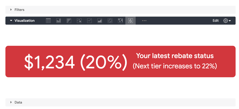
I need to show/customize that as a Look like shown in the attached image format. Do I need to use any other Visualization charts or any other out of box components to achieve such ?
Can some please help a novice like me, how to achieve in such format? Any sample Looks or Tiles available to refer?

Solved! Go to Solution.
- Mark as New
- Bookmark
- Subscribe
- Mute
- Subscribe to RSS Feed
- Permalink
- Report Inappropriate Content
- Mark as New
- Bookmark
- Subscribe
- Mute
- Subscribe to RSS Feed
- Permalink
- Report Inappropriate Content
You can do this with a combination of some html on your measure and selecting a single value viz.
Sample LookML:
measure: example {
type: count
html:
<div style="border-radius: 10px; background-color: #d3363d; color: #fff;">
    <div style="font-size: 4rem; display: inline-block;">{{ value }} (20%)</div>
    <div style="display: inline-block;">
    <p style="font-size: 1.5rem;"><strong>Your latest rebate status</strong></p>
    <p style="font-size: 1.5rem;">(Next tier increases to 22%)</p>
    </div>
</div> ;;
}
Result:

- Mark as New
- Bookmark
- Subscribe
- Mute
- Subscribe to RSS Feed
- Permalink
- Report Inappropriate Content
- Mark as New
- Bookmark
- Subscribe
- Mute
- Subscribe to RSS Feed
- Permalink
- Report Inappropriate Content
Hi Team,
Any suggestions/ideas for this layout/design?
Regards!
- Mark as New
- Bookmark
- Subscribe
- Mute
- Subscribe to RSS Feed
- Permalink
- Report Inappropriate Content
- Mark as New
- Bookmark
- Subscribe
- Mute
- Subscribe to RSS Feed
- Permalink
- Report Inappropriate Content
You can do this with a combination of some html on your measure and selecting a single value viz.
Sample LookML:
measure: example {
type: count
html:
<div style="border-radius: 10px; background-color: #d3363d; color: #fff;">
    <div style="font-size: 4rem; display: inline-block;">{{ value }} (20%)</div>
    <div style="display: inline-block;">
    <p style="font-size: 1.5rem;"><strong>Your latest rebate status</strong></p>
    <p style="font-size: 1.5rem;">(Next tier increases to 22%)</p>
    </div>
</div> ;;
}
Result:

- Mark as New
- Bookmark
- Subscribe
- Mute
- Subscribe to RSS Feed
- Permalink
- Report Inappropriate Content
- Mark as New
- Bookmark
- Subscribe
- Mute
- Subscribe to RSS Feed
- Permalink
- Report Inappropriate Content
Thank you @brecht .
This helps a lot for a novice like me. Gives me a good learning. Any good learning portals to learn more about these HTML usage in LookML scripts?
Also What if - I want to have my numbers ($1234, 20%, 22% etc.) dynamically changed as per selections, how those can be incorporated in the HTML?
I already have a KPI build which can show the $1234. Lets say its the 20% of the total sales. So 20% is the dynamic percentage as per scale range and would show.
22% is the next number in the scale range also.
A derived table, I have used like this below -
view: rebate_table {
derived_table: {
sql:
SELECT
0 AS low,
500 AS high,
20 AS percent
UNION ALL
SELECT 501, 1000, 22
UNION ALL
SELECT 1001, 5000, 24 ;;
}
dimension: low {
type: number
sql: ${TABLE}.low ;;
}
dimension: high {
type: number
sql: ${TABLE}.high ;;
}
dimension: percent {
type: number
sql: ${TABLE}.percent ;;
}
}
- Mark as New
- Bookmark
- Subscribe
- Mute
- Subscribe to RSS Feed
- Permalink
- Report Inappropriate Content
- Mark as New
- Bookmark
- Subscribe
- Mute
- Subscribe to RSS Feed
- Permalink
- Report Inappropriate Content
In general, any inline styling on html tags works I believe. So common css will work, but you won’t be able to use pseudo-classes and such.
To reference other fields on your tile, you can use the {{ other_field._value }} syntax, e.g:
measure: example {
type: count
html:
<div style="border-radius: 10px; background-color: #d3363d; color: #fff;">
    <div style="font-size: 4rem; display: inline-block;">{{ value }} ({{ percent._value }})</div>
    <div style="display: inline-block;">
    <p style="font-size: 1.5rem;"><strong>Your latest rebate status</strong></p>
    <p style="font-size: 1.5rem;">(Next tier increases to {{ min._value }})</p>
    </div>
</div> ;;
}- Mark as New
- Bookmark
- Subscribe
- Mute
- Subscribe to RSS Feed
- Permalink
- Report Inappropriate Content
- Mark as New
- Bookmark
- Subscribe
- Mute
- Subscribe to RSS Feed
- Permalink
- Report Inappropriate Content
Thank you @brecht , for the support. ![]()
I will continue working as guided, and will let you know for any findings.
Meanwhile, can you also help me with this query in this thread:
https://community.looker.com/lookml-5/calculate-week-days-days-elapsed-and-days-remaining-for-curren...Regards!
-
access grant
4 -
actionhub
9 -
Actions
14 -
Admin
4 -
alert
29 -
Analytics
2 -
Analytics Block
36 -
Analytics General
1 -
API
12 -
bar
10 -
bestpractice
4 -
BigQuery
8 -
blocks
1 -
boards
4 -
Bug
168 -
cache
2 -
case
2 -
chart
17 -
cohort
1 -
connection
5 -
connection database
1 -
content access
1 -
content-validator
2 -
count
6 -
custom dimension
9 -
custom field
19 -
custom measure
8 -
customdimension
9 -
Dashboards
761 -
Data
5 -
Data Sources
4 -
data tab
4 -
Database
5 -
datagroup
2 -
date-formatting
14 -
dates
18 -
derivedtable
1 -
develop
1 -
development
3 -
dimension
17 -
done
8 -
download
19 -
downloading
9 -
drill-down
1 -
drilling
30 -
dynamic
1 -
embed
10 -
Errors
13 -
etl
1 -
explore
84 -
Explores
142 -
extends
1 -
feature-requests
10 -
filed
3 -
filter
245 -
Filtering
127 -
folders
4 -
formatting
19 -
git
2 -
Google Data Studio
2 -
Google Sheets
2 -
googlesheets
7 -
graph
9 -
group by
6 -
html
12 -
i__looker
1 -
imported project
2 -
Integrations
4 -
javascript
2 -
join
2 -
json
3 -
label
4 -
line chart
17 -
link
5 -
links
3 -
liquid
22 -
Looker
7 -
Looker Studio Pro
51 -
LookerStudio
7 -
lookml
169 -
lookml dashboard
15 -
looks
194 -
manage projects
1 -
map
30 -
map_layer
5 -
Marketplace
4 -
measure
4 -
Memorystore for Memcached
1 -
merge
14 -
model
3 -
modeling
2 -
multiple select
1 -
ndt
1 -
parameter
11 -
pdf
8 -
pdt
8 -
performance
7 -
periodoverperiod
5 -
permission management
1 -
persistence
1 -
pivot
21 -
postgresql
1 -
python
2 -
pythonsdk
2 -
Query
3 -
quickstart
4 -
ReactJS
1 -
redshift
4 -
release
16 -
rendering
8 -
Reporting
10 -
schedule
51 -
schedule delivery
5 -
sdk
1 -
Security
4 -
sharing
2 -
singlevalue
16 -
snowflake
3 -
sql
24 -
SSO
1 -
stacked chart
10 -
system activity
5 -
table chart
16 -
tablecalcs
144 -
Tile
12 -
time
8 -
time zone
3 -
totals
13 -
Training
1 -
Ui
19 -
usage
4 -
user access management
3 -
user management
3 -
user-attributes
6 -
value_format
4 -
view
4 -
Views
4 -
visualizations
558 -
watch
1 -
webhook
2
- « Previous
- Next »

 Twitter