- Looker
- Looker Forums
- Exploring & Curating Data
- Axis Labels for grouped charts
- Subscribe to RSS Feed
- Mark Topic as New
- Mark Topic as Read
- Float this Topic for Current User
- Bookmark
- Subscribe
- Mute
- Printer Friendly Page
- Mark as New
- Bookmark
- Subscribe
- Mute
- Subscribe to RSS Feed
- Permalink
- Report Inappropriate Content
- Mark as New
- Bookmark
- Subscribe
- Mute
- Subscribe to RSS Feed
- Permalink
- Report Inappropriate Content
Hello,
I am brand new to Looker, coming from a Tableau/Power BI background. I have had some difficulty with what would seem like easy formatting items, most recently having all value labels and axis labels show up consistently.
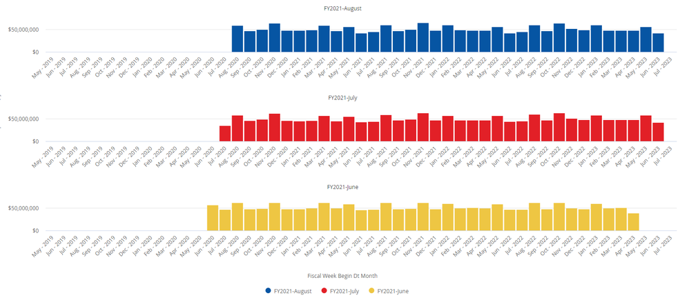
My current problem is that I would like to have a grouped grid layout that show multiple series in the same chart but separated out to be able to clearly see differences when comparing items. I have achieved this by using the “Grid Layout” and selecting By Pivot which gives me the look I want.
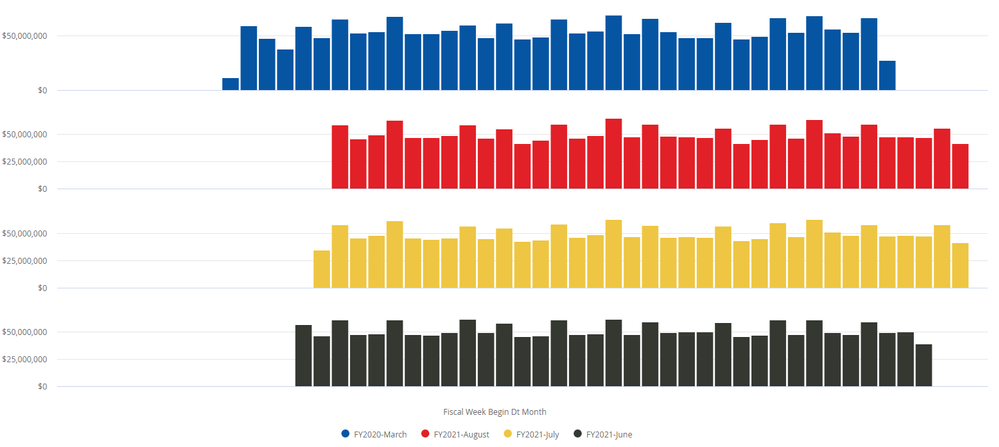
Unfortunately, when I do this, I get different views that depend on how many series I include in my report. This needs to be dynamic for the user, and therefore should have the same look regardless if there’s one series or four. The x axis labels show up if I have 1-3 series displayed, but disappear when I add more.
I am hoping someone can assist in either helping me force my axis labels to show up once on the bottom of my chart (preferred), or force value labels regardless of how many series are included. Please see screen shots of what is currently happening.


- Labels:
-
formatting
-
visualizations
-
access grant
4 -
actionhub
9 -
Actions
14 -
Admin
4 -
alert
29 -
Analytics
2 -
Analytics Block
36 -
Analytics General
1 -
API
12 -
bar
10 -
bestpractice
4 -
BigQuery
8 -
blocks
1 -
boards
4 -
Bug
168 -
cache
2 -
case
2 -
chart
17 -
cohort
1 -
connection
5 -
connection database
1 -
content access
1 -
content-validator
2 -
count
6 -
custom dimension
9 -
custom field
19 -
custom measure
8 -
customdimension
9 -
Dashboards
762 -
Data
5 -
Data Sources
4 -
data tab
4 -
Database
5 -
datagroup
2 -
date-formatting
14 -
dates
18 -
derivedtable
1 -
develop
1 -
development
3 -
dimension
17 -
done
8 -
download
19 -
downloading
9 -
drill-down
1 -
drilling
30 -
dynamic
1 -
embed
10 -
Errors
13 -
etl
1 -
explore
84 -
Explores
143 -
extends
1 -
feature-requests
10 -
filed
3 -
filter
245 -
Filtering
127 -
folders
4 -
formatting
19 -
git
2 -
Google Data Studio
2 -
Google Sheets
2 -
googlesheets
7 -
graph
9 -
group by
6 -
html
12 -
i__looker
1 -
imported project
2 -
Integrations
4 -
javascript
2 -
join
2 -
json
3 -
label
4 -
line chart
17 -
link
5 -
links
3 -
liquid
22 -
Looker
7 -
Looker Studio Pro
51 -
LookerStudio
7 -
lookml
169 -
lookml dashboard
15 -
looks
195 -
manage projects
1 -
map
30 -
map_layer
5 -
Marketplace
4 -
measure
4 -
Memorystore for Memcached
1 -
merge
14 -
model
3 -
modeling
2 -
multiple select
1 -
ndt
1 -
parameter
11 -
pdf
8 -
pdt
8 -
performance
7 -
periodoverperiod
5 -
permission management
1 -
persistence
1 -
pivot
21 -
postgresql
1 -
python
2 -
pythonsdk
2 -
Query
3 -
quickstart
4 -
ReactJS
1 -
redshift
4 -
release
16 -
rendering
8 -
Reporting
10 -
schedule
51 -
schedule delivery
5 -
sdk
1 -
Security
4 -
sharing
2 -
singlevalue
16 -
snowflake
3 -
sql
24 -
SSO
1 -
stacked chart
10 -
system activity
5 -
table chart
16 -
tablecalcs
144 -
Tile
12 -
time
8 -
time zone
3 -
totals
13 -
Training
1 -
Ui
19 -
usage
4 -
user access management
3 -
user management
3 -
user-attributes
6 -
value_format
4 -
view
4 -
Views
4 -
visualizations
558 -
watch
1 -
webhook
2
- « Previous
- Next »

 Twitter