- Looker
- Looker Forums
- Developing Applications
- Do I need custom visualizations to achieve this lo...
- Subscribe to RSS Feed
- Mark Topic as New
- Mark Topic as Read
- Float this Topic for Current User
- Bookmark
- Subscribe
- Mute
- Printer Friendly Page
- Mark as New
- Bookmark
- Subscribe
- Mute
- Subscribe to RSS Feed
- Permalink
- Report Inappropriate Content
- Mark as New
- Bookmark
- Subscribe
- Mute
- Subscribe to RSS Feed
- Permalink
- Report Inappropriate Content
Hello,
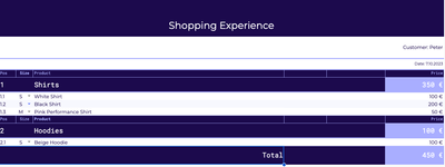
I want to create this look for my dashboard.
Now the challenges:
1) For "Customer: Peter"-Label: is it possible to have a text label that uses data of mine but as a text and not as a number?
2) I want products to be grouped by the category they belong to, eg my shirts under the category Shirts, and my Hoodie unter the category Hoodies. But how do I create this look? I do need a custom visualizations that creates charts according to the categories and then stack on top of each other until all categories have been listed. Is it possible to create this?
3) How can you create a flexible total position, that puts itself right at the end after all products have been listed?
4) Is it possible to create this exact color border scheme with the pink color framing the columns of the dark purple?
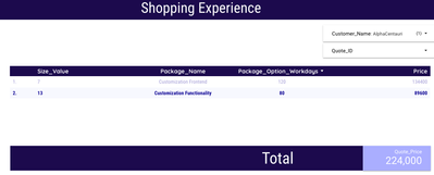
I've made this, but the things above are still bugging me:
That's how I would create this given look. I'm also open for different suggestions on how to do it or if there's even a better way. Thanks!
- Labels:
-
Actions
-
access grant
1 -
actionhub
6 -
Actions
68 -
Admin
3 -
AI ML General
1 -
alert
1 -
Analytics Block
15 -
API
159 -
Authentication
8 -
BigQuery
7 -
blocks
2 -
boards
4 -
Bug
23 -
cache
2 -
Components
40 -
connection
5 -
connection database
2 -
content access
1 -
content-validator
3 -
customdimension
1 -
Dashboards
92 -
Data
4 -
Data Sources
1 -
Database
3 -
deprecated
1 -
derivedtable
2 -
develop
2 -
development
2 -
done
3 -
downloading
1 -
drilling
3 -
dynamic
2 -
embed
60 -
Embedding
37 -
Errors
6 -
etl
2 -
explore
4 -
Explores
4 -
Extensions
15 -
feature-requests
2 -
filed
1 -
filter
35 -
folders
2 -
Gemini
1 -
git
7 -
Google Sheets
1 -
googlesheets
1 -
i__looker
1 -
Integrations
1 -
javascript
5 -
json
2 -
links
1 -
liquid
1 -
Looker API
79 -
LookerStudio
1 -
lookml
38 -
lookml dashboard
3 -
looks
11 -
Marketplace
9 -
merge
2 -
modeling
1 -
mysql
1 -
Networking
1 -
on-hold
1 -
parameter
2 -
pdf
3 -
pdt
2 -
permission management
3 -
postgresql
1 -
Projects
1 -
python
26 -
pythonsdk
7 -
Query
11 -
query manager
2 -
quickstart
1 -
ReactJS
10 -
redshift
3 -
release
6 -
schedule
16 -
schedule delivery
2 -
sdk
56 -
server configuration
1 -
sharing
1 -
snowflake
2 -
sql
7 -
SSO
7 -
system activity
2 -
tests
1 -
Ui
1 -
user access management
3 -
user management
5 -
user-attributes
12 -
Vertex AI Platform
1 -
Views
2 -
visualizations
44 -
watch
1 -
webhook
6
- « Previous
- Next »

 Twitter
