- Looker & Looker Studio
- Looker Forums
- Administering Looker
- Re: Bar Chart with Custom Field Values and Employe...
- Subscribe to RSS Feed
- Mark Topic as New
- Mark Topic as Read
- Float this Topic for Current User
- Bookmark
- Subscribe
- Mute
- Printer Friendly Page
- Mark as New
- Bookmark
- Subscribe
- Mute
- Subscribe to RSS Feed
- Permalink
- Report Inappropriate Content
- Mark as New
- Bookmark
- Subscribe
- Mute
- Subscribe to RSS Feed
- Permalink
- Report Inappropriate Content
Hello Looker Brains!
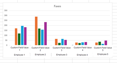
I have a unique request with Custom Field Values pulled from a form. The form is asking how many and an expression is required to convert the values to numbers with the to_number(${ticket_ticket.field_1_value}). We are looking for a bar chart similar to this:
Where each bar is calculating off the expression. Is this possible? Thank you for your brain power!
- Labels:
-
Analytics Block
- Mark as New
- Bookmark
- Subscribe
- Mute
- Subscribe to RSS Feed
- Permalink
- Report Inappropriate Content
- Mark as New
- Bookmark
- Subscribe
- Mute
- Subscribe to RSS Feed
- Permalink
- Report Inappropriate Content
I'm not sure I understand. Does each "custom field value" have four smaller values in it? Or maybe my real question is, what do the colors of the bars represent?
- Mark as New
- Bookmark
- Subscribe
- Mute
- Subscribe to RSS Feed
- Permalink
- Report Inappropriate Content
- Mark as New
- Bookmark
- Subscribe
- Mute
- Subscribe to RSS Feed
- Permalink
- Report Inappropriate Content
Each "custom field value" has a number for each employee. Each bar represents each employee.
- Mark as New
- Bookmark
- Subscribe
- Mute
- Subscribe to RSS Feed
- Permalink
- Report Inappropriate Content
- Mark as New
- Bookmark
- Subscribe
- Mute
- Subscribe to RSS Feed
- Permalink
- Report Inappropriate Content
Hm, I'm still not following. Can you share a mockup of how the data looks in a table?
- Mark as New
- Bookmark
- Subscribe
- Mute
- Subscribe to RSS Feed
- Permalink
- Report Inappropriate Content
- Mark as New
- Bookmark
- Subscribe
- Mute
- Subscribe to RSS Feed
- Permalink
- Report Inappropriate Content
The Custom Field 1 is pulling in a number that the employee entered on the form. An expression was created to convert that data from text to a number in an Expression: to_number(${ticket_ticket.field_1_value}). There are 5 employees, 1 employee per bar in the 5 different groupings of workplace.
- Mark as New
- Bookmark
- Subscribe
- Mute
- Subscribe to RSS Feed
- Permalink
- Report Inappropriate Content
- Mark as New
- Bookmark
- Subscribe
- Mute
- Subscribe to RSS Feed
- Permalink
- Report Inappropriate Content
Thanks so much for sharing the table! This really helps me understand.
The best practice here would be to create a measure in LookML for each of the custom values. You can use the "max" measure type since it will just return the same value as the custom value when you're grouping by employee.
measure: custom_value_1_measure {
  type: max
  sql: ${custom_value_1} ;;
}
Then you can select each of those measures alongside the Employee dimension. You'd get one set of bars for each employee, with each set containing each of the custom values. I know it's kind of the opposite of the chart you wanted, but hopefully it still conveys the information you're looking for?
I made a mockup of what I'm talking about:
-
access grant
5 -
actionhub
2 -
Actions
4 -
Admin
32 -
alert
6 -
Analytics
1 -
Analytics Block
17 -
API
10 -
Authentication
13 -
bestpractice
1 -
BigQuery
13 -
blocks
2 -
boards
5 -
Bug
30 -
cache
3 -
Cloud Error Reporting
1 -
Cloud Load Balancing
1 -
connection
20 -
connection database
4 -
content access
4 -
content-validator
2 -
custom field
2 -
custom measure
1 -
Dashboards
27 -
Data
1 -
Data Sources
1 -
Database
13 -
datagroup
1 -
derivedtable
1 -
develop
1 -
development
2 -
done
1 -
download
4 -
downloading
2 -
embed
8 -
Errors
9 -
explore
9 -
Explores
1 -
Extensions
1 -
feature-requests
2 -
filed
1 -
filter
12 -
folders
2 -
formatting
1 -
General Looker Administration
171 -
git
16 -
Google Sheets
1 -
googlesheets
1 -
i__looker
3 -
imported project
1 -
Integrations
1 -
internal db
4 -
liquid
1 -
Looker
5 -
LookerStudio
1 -
lookml
13 -
looks
4 -
manage projects
2 -
Marketplace
2 -
model
1 -
modeling
1 -
mysql
5 -
Networking
3 -
pdf
1 -
pdt
6 -
performance
3 -
permission management
12 -
Projects
3 -
query manager
1 -
redshift
6 -
release
9 -
rendering
1 -
Reporting
1 -
schedule
20 -
schedule delivery
2 -
sdk
2 -
Security
8 -
server configuration
2 -
Setting up your Looker Instance
36 -
sharing
2 -
snowflake
1 -
sql
4 -
SSO
7 -
system activity
8 -
time zone
2 -
Training
2 -
Ui
2 -
usage
5 -
User access & management
48 -
user access management
10 -
user management
8 -
user-attributes
9 -
visualizations
7 -
webhook
3
- « Previous
- Next »

 Twitter

