- Looker
- Looker Forums
- Exploring & Curating Data
- why are the visualisations on the marketplace not ...
- Subscribe to RSS Feed
- Mark Topic as New
- Mark Topic as Read
- Float this Topic for Current User
- Bookmark
- Subscribe
- Mute
- Printer Friendly Page
- Mark as New
- Bookmark
- Subscribe
- Mute
- Subscribe to RSS Feed
- Permalink
- Report Inappropriate Content
- Mark as New
- Bookmark
- Subscribe
- Mute
- Subscribe to RSS Feed
- Permalink
- Report Inappropriate Content
why are the visualisations on the marketplace not just available in Looker?
- Labels:
-
visualizations
- Mark as New
- Bookmark
- Subscribe
- Mute
- Subscribe to RSS Feed
- Permalink
- Report Inappropriate Content
- Mark as New
- Bookmark
- Subscribe
- Mute
- Subscribe to RSS Feed
- Permalink
- Report Inappropriate Content
I suspect it’s because the majority of them don’t really work very well, and/or are incredibly limited in the visualization options department.
- Mark as New
- Bookmark
- Subscribe
- Mute
- Subscribe to RSS Feed
- Permalink
- Report Inappropriate Content
- Mark as New
- Bookmark
- Subscribe
- Mute
- Subscribe to RSS Feed
- Permalink
- Report Inappropriate Content
That is a pity - because there are a number of really useful visualisations there.
- Mark as New
- Bookmark
- Subscribe
- Mute
- Subscribe to RSS Feed
- Permalink
- Report Inappropriate Content
- Mark as New
- Bookmark
- Subscribe
- Mute
- Subscribe to RSS Feed
- Permalink
- Report Inappropriate Content
Hey @GenDemo if you don’t mind me asking what ones have you found are pretty good? Haven’t dug into them myself and would love a recommendation or two if you have any!
- Mark as New
- Bookmark
- Subscribe
- Mute
- Subscribe to RSS Feed
- Permalink
- Report Inappropriate Content
- Mark as New
- Bookmark
- Subscribe
- Mute
- Subscribe to RSS Feed
- Permalink
- Report Inappropriate Content
sure -
the Sankey graphs are interesting. Though I am not always sure how well they can be read. We use them to see how long ZenDesk tickets take to get closed.
Then the multi-Value (which is a single value visulisation, but you can put 2 things in with better titles) is awesome! but its super glitchy being in beta only.
Then the guage visualisation is a huge hit in the finance industry.
The calendar heat map is quite nice for tracking site hits or similar things.
- Mark as New
- Bookmark
- Subscribe
- Mute
- Subscribe to RSS Feed
- Permalink
- Report Inappropriate Content
- Mark as New
- Bookmark
- Subscribe
- Mute
- Subscribe to RSS Feed
- Permalink
- Report Inappropriate Content
@GenDemo thanks so much for these! The multi-value tile looks fantastic, literally working on something now this would be perfect for. All these are great though, I’m sure our team will love them, thanks again!
- Mark as New
- Bookmark
- Subscribe
- Mute
- Subscribe to RSS Feed
- Permalink
- Report Inappropriate Content
- Mark as New
- Bookmark
- Subscribe
- Mute
- Subscribe to RSS Feed
- Permalink
- Report Inappropriate Content
@GenDemo @svickers - Hey there, Dillon Morrison here, Product Manager for Looker’s Marketplace. It’s a great question, and I’m happy to say the reason is not because the visualizations don’t work well and/or are not supported by our product team. If you do see one that doesn’t work well, please let us know and we’ll get the issue fixed! I summarized our thinking around marketplace visualizations below, so feel free to jump down there, but I thought some background might be helpful as well.
Quick Background on Marketplace Visualizations
We at Looker recognize that we’ll never be able to create every viz for every single customer need. We have healthcare companies that want visualizations of a human silhouette, sports teams that want maps of their stadiums, etc… While these are awesome visualizations, they won’t apply to 99.9% of Lookers customers, so we don’t invest in those visualizations natively. Instead, we offer a framework to allow Looker customers to build and surface their own custom visualizations inside of Looker. This framework has been out for some time, and we’ve been able to amass a number of powerful visualizations that were built by customers, partners, internal analysts, etc… We wanted a way to bring these visualizations to our entire customer base, while still allowing our community to submit PRs and update these visualization. To do that, we introduced the Marketplace, which allows Looker to distribute, manage, and version these visualization to all our users. We also fully support all of these visualizations, meaning that we fix bugs and actively make improvements, just like any other part of our product.
Native Visualization versus Marketplace Visualization? Why Should I Care?
From a functionality perspective, you really shouldn’t care. To your dashboard and Explore users, there should be largely no difference (except for minor configurations as noted in reason #3). From a technical perspective, there are a few differences between our Marketplace and Native visualizations:
-
Open Source / Extensibility - Marketplace visualizations are fully managed and supported by Looker, but are also open-source, so they can can be updated or improved by anyone in the community. If a visualization becomes popular enough, we have the ability to “promote” the viz to something offered natively.
-
Visualization Libraries - Looker’s native visualizations are all built on a single JS library for consistency, management, etc… Marketplace visualizations are not beholden to this constraint, so any user can create visualizations using the library of their preference.
-
Maturity - Some marketplace visualizations do not have the same amount of configurability as our native visualization. This does not mean that they visualizations are not supported or fully functional, simply that they lack some configurability at the moment. We’re always looking to add configuration options that make sense, and happily accept PRs from the community to move the development forward.
Hope that helps. Please let me know any additional questions you might have!
- Mark as New
- Bookmark
- Subscribe
- Mute
- Subscribe to RSS Feed
- Permalink
- Report Inappropriate Content
- Mark as New
- Bookmark
- Subscribe
- Mute
- Subscribe to RSS Feed
- Permalink
- Report Inappropriate Content
Here’s some to start: Multi Value Viz not showing for embed user
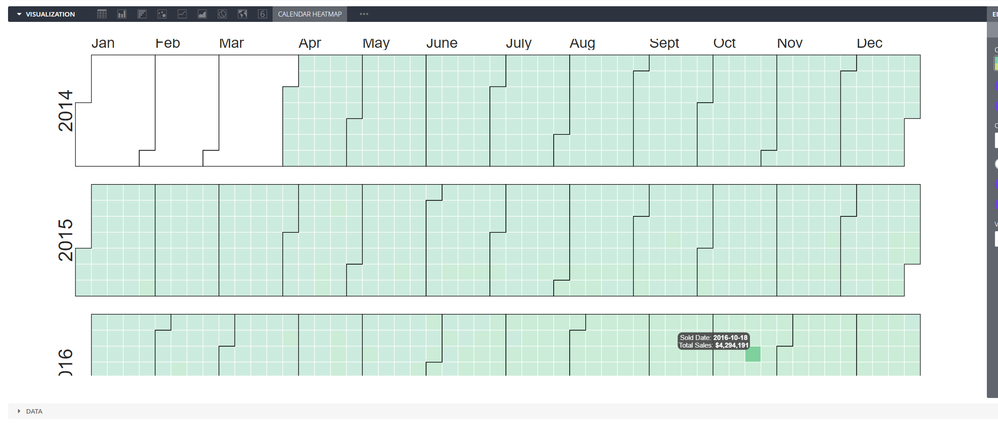
The calendar heatmap doesn’t scale to the window so frequently gets cut off

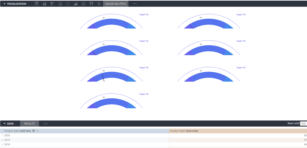
Similar issue with the multiple gauge

There are other rendering issues we have encountered as well. But those aside often the customization options are comically small so they don’t end up being very useful, maybe it’s just our more advanced use cases though. That is what led me to comment that they just don’t feel ready for prime time yet, especially with the options available to the classic vizs.
- Mark as New
- Bookmark
- Subscribe
- Mute
- Subscribe to RSS Feed
- Permalink
- Report Inappropriate Content
- Mark as New
- Bookmark
- Subscribe
- Mute
- Subscribe to RSS Feed
- Permalink
- Report Inappropriate Content
Hey @svickers ! Thank you for your feedback.
Regarding “Multiple Value Visualization” and embed-user support – There were some changes to Chrome recently that we are working to address. We just pushed out an update to the MV viz that moves hosting from the internal server to our CDN, which should by-pass the problem.
We’ve noticed that about Calendar Heatmap, and are considering ways to address that problem for all custom visualizations. In the meantime, I’ve noticed that decreasing the width of my browser (if I’m using a large external monitor) helps while editing in the Explore. And like some other custom visualizations, there are certain tile aspect ratios that look better than others. Tile width is primarily the variable you can manipulate with this viz to size appropriately.
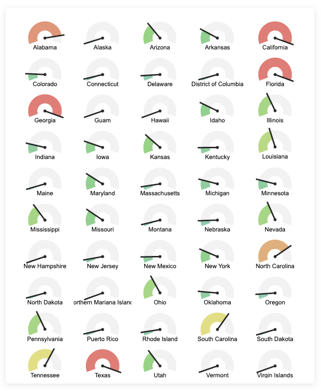
And I hope you’ll give our Radial Gauge a shot to replace the Gauge Multiple viz you showed above. Using the Trellis functionality can you make viz like this:

Again, thanks for your feedback & effort in improving the Marketplace visualizations 😃
-
access grant
4 -
actionhub
9 -
Actions
14 -
Admin
4 -
alert
29 -
Analytics
2 -
Analytics Block
35 -
Analytics General
1 -
API
12 -
bar
10 -
bestpractice
4 -
BigQuery
8 -
blocks
1 -
boards
4 -
Bug
168 -
cache
2 -
case
2 -
chart
17 -
cohort
1 -
connection
5 -
connection database
1 -
content access
1 -
content-validator
2 -
count
6 -
custom dimension
9 -
custom field
19 -
custom measure
8 -
customdimension
9 -
Dashboards
756 -
Data
5 -
Data Sources
4 -
data tab
4 -
Database
5 -
datagroup
2 -
date-formatting
14 -
dates
18 -
derivedtable
1 -
develop
1 -
development
3 -
dimension
17 -
done
8 -
download
19 -
downloading
9 -
drill-down
1 -
drilling
30 -
dynamic
1 -
embed
10 -
Errors
13 -
etl
1 -
explore
84 -
Explores
135 -
extends
1 -
feature-requests
10 -
filed
3 -
filter
245 -
Filtering
120 -
folders
4 -
formatting
19 -
git
2 -
Google Data Studio
2 -
Google Sheets
2 -
googlesheets
7 -
graph
9 -
group by
6 -
html
12 -
i__looker
1 -
imported project
2 -
Integrations
4 -
javascript
2 -
join
2 -
json
3 -
label
4 -
line chart
17 -
link
5 -
links
3 -
liquid
22 -
Looker
6 -
Looker Studio Pro
48 -
LookerStudio
7 -
lookml
169 -
lookml dashboard
15 -
looks
189 -
manage projects
1 -
map
30 -
map_layer
5 -
Marketplace
4 -
measure
4 -
Memorystore for Memcached
1 -
merge
14 -
model
3 -
modeling
2 -
multiple select
1 -
ndt
1 -
parameter
11 -
pdf
8 -
pdt
8 -
performance
7 -
periodoverperiod
5 -
permission management
1 -
persistence
1 -
pivot
21 -
postgresql
1 -
python
2 -
pythonsdk
2 -
Query
3 -
quickstart
4 -
ReactJS
1 -
redshift
4 -
release
16 -
rendering
8 -
Reporting
10 -
schedule
51 -
schedule delivery
5 -
sdk
1 -
Security
4 -
sharing
2 -
singlevalue
16 -
snowflake
3 -
sql
24 -
SSO
1 -
stacked chart
10 -
system activity
5 -
table chart
16 -
tablecalcs
144 -
Tile
12 -
time
8 -
time zone
3 -
totals
13 -
Training
1 -
Ui
19 -
usage
4 -
user access management
3 -
user management
3 -
user-attributes
6 -
value_format
4 -
view
4 -
Views
4 -
visualizations
558 -
watch
1 -
webhook
2
- « Previous
- Next »

 Twitter