- Looker
- Looker Forums
- Exploring & Curating Data
- Toggling dimensions in a single graph (e.g. a dive...
- Subscribe to RSS Feed
- Mark Topic as New
- Mark Topic as Read
- Float this Topic for Current User
- Bookmark
- Subscribe
- Mute
- Printer Friendly Page
- Mark as New
- Bookmark
- Subscribe
- Mute
- Subscribe to RSS Feed
- Permalink
- Report Inappropriate Content
- Mark as New
- Bookmark
- Subscribe
- Mute
- Subscribe to RSS Feed
- Permalink
- Report Inappropriate Content
Hi Looker experts, I’m looking to create a dashboard for diversity analysis of an org.’s hiring practice. The dashboard should dissect a group of people on 2 dimensions:
- diversity criteria (e.g. gender, race, ethnicity)
- the stages in the hiring process (e.g. shortlisting, interview, selected, job offered
While the second dimension (stages) will remain static, the user should be able to toggle the first dimension - view the dissection across stages by gender first, then toggle to viewing by race etc.
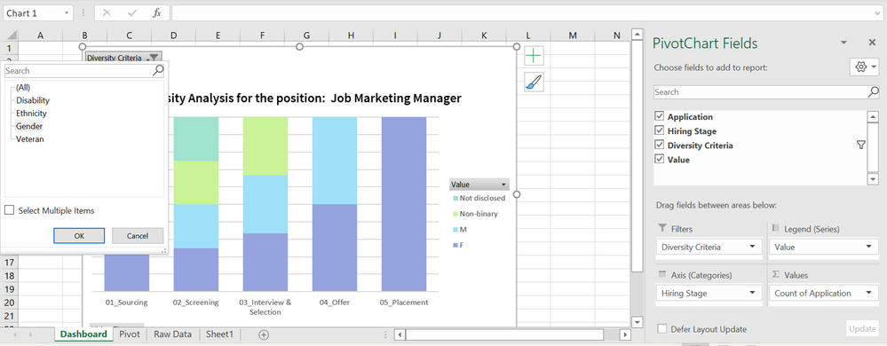
I could mock this up in Excel as shown in the pic. The diversity criteria is the filter to the overall graph, so users can toggle that attribute.
Would like to understand how I can create something similar in Looker.
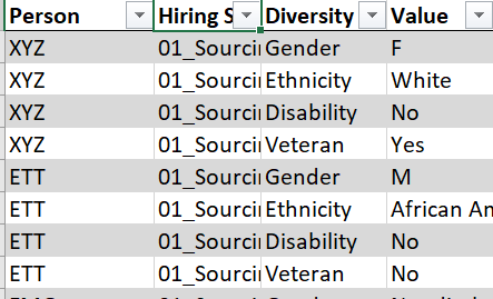
(I have shared a snapshot of the data model that I used to get the chart in Excel as well.)


- Labels:
-
Dashboards
-
filter
-
visualizations
- Mark as New
- Bookmark
- Subscribe
- Mute
- Subscribe to RSS Feed
- Permalink
- Report Inappropriate Content
- Mark as New
- Bookmark
- Subscribe
- Mute
- Subscribe to RSS Feed
- Permalink
- Report Inappropriate Content
If I understood you correctly, your case could use something called Dynamic Measures, which is a bit of a pattern/hack in Looker. Have a look at this post:
The only difference is that you would do it do a dimension, I don’t see any problems with that. The only possible downside is that in the parameter you have to specify list of columns that can be selected
-
access grant
4 -
actionhub
9 -
actions
14 -
Admin
4 -
alert
29 -
Analytics
2 -
Analytics Block
33 -
Analytics General
1 -
API
12 -
bar
10 -
bestpractice
4 -
BigQuery
8 -
blocks
1 -
boards
4 -
Bug
168 -
cache
2 -
case
2 -
chart
17 -
cohort
1 -
connection
5 -
connection database
1 -
content access
1 -
content-validator
2 -
count
6 -
custom dimension
9 -
custom field
19 -
custom measure
8 -
customdimension
9 -
Dashboards
751 -
Data
5 -
Data Sources
4 -
data tab
4 -
Database
5 -
datagroup
2 -
date-formatting
14 -
dates
18 -
derivedtable
1 -
develop
1 -
development
3 -
dimension
17 -
done
8 -
download
19 -
downloading
9 -
drill-down
1 -
drilling
30 -
dynamic
1 -
embed
10 -
Errors
13 -
etl
1 -
explore
84 -
Explores
133 -
extends
1 -
feature-requests
10 -
filed
3 -
filter
245 -
Filtering
116 -
folders
4 -
formatting
19 -
git
2 -
Google Data Studio
2 -
Google Sheets
2 -
googlesheets
7 -
graph
9 -
group by
6 -
html
12 -
i__looker
1 -
imported project
2 -
Integrations
4 -
javascript
2 -
join
2 -
json
3 -
label
4 -
line chart
17 -
link
5 -
links
3 -
liquid
22 -
Looker
6 -
Looker Studio Pro
46 -
LookerStudio
7 -
lookml
169 -
lookml dashboard
15 -
looks
187 -
manage projects
1 -
map
30 -
map_layer
5 -
Marketplace
4 -
measure
4 -
Memorystore for Memcached
1 -
merge
14 -
model
3 -
modeling
2 -
multiple select
1 -
ndt
1 -
parameter
11 -
pdf
8 -
pdt
8 -
performance
7 -
periodoverperiod
5 -
permission management
1 -
persistence
1 -
pivot
21 -
postgresql
1 -
python
2 -
pythonsdk
2 -
Query
3 -
quickstart
4 -
ReactJS
1 -
redshift
4 -
release
16 -
rendering
8 -
Reporting
10 -
schedule
51 -
schedule delivery
5 -
sdk
1 -
Security
4 -
sharing
2 -
singlevalue
16 -
snowflake
3 -
sql
24 -
SSO
1 -
stacked chart
10 -
system activity
5 -
table chart
16 -
tablecalcs
144 -
Tile
12 -
time
8 -
time zone
3 -
totals
13 -
Training
1 -
Ui
19 -
usage
4 -
user access management
3 -
user management
3 -
user-attributes
6 -
value_format
4 -
view
4 -
Views
4 -
visualizations
558 -
watch
1 -
webhook
2
- « Previous
- Next »

 Twitter