- Looker
- Looker Forums
- Exploring & Curating Data
- Measure vs. Measure Scatterplots (3.28+)
- Subscribe to RSS Feed
- Mark Topic as New
- Mark Topic as Read
- Float this Topic for Current User
- Bookmark
- Subscribe
- Mute
- Printer Friendly Page
- Mark as New
- Bookmark
- Subscribe
- Mute
- Subscribe to RSS Feed
- Permalink
- Report Inappropriate Content
- Mark as New
- Bookmark
- Subscribe
- Mute
- Subscribe to RSS Feed
- Permalink
- Report Inappropriate Content
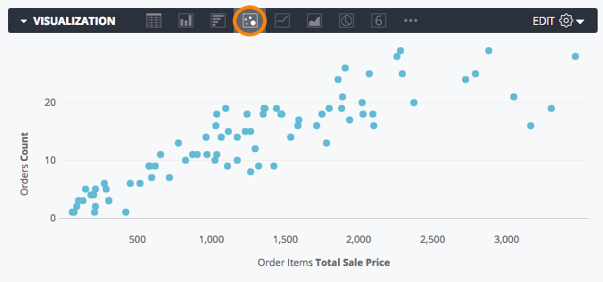
As of version 3.28, you can now plot measure vs. measure scatterplots. This can be done by hiding the dimension(s) in the data table from the visualization.
For example, say you have this data table:
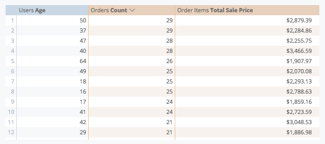
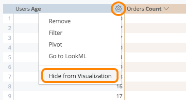
In order to chart Orders Count vs. Order Items Total Sale Price, you will want to hide Users Age from the visualization by selecting Hide from Visualization from that column’s gear dropdown:
After selecting scatter from the chart icon options, you should see a chart like this!
- Mark as New
- Bookmark
- Subscribe
- Mute
- Subscribe to RSS Feed
- Permalink
- Report Inappropriate Content
- Mark as New
- Bookmark
- Subscribe
- Mute
- Subscribe to RSS Feed
- Permalink
- Report Inappropriate Content
Is it possible to show the hidden field in the tooltip? or to colour each dot in the plot by category?
- Mark as New
- Bookmark
- Subscribe
- Mute
- Subscribe to RSS Feed
- Permalink
- Report Inappropriate Content
- Mark as New
- Bookmark
- Subscribe
- Mute
- Subscribe to RSS Feed
- Permalink
- Report Inappropriate Content
Hey Paul,
This is not currently possible but I have passed the idea along to product and engineering for consideration!
Best,
Nicole
- Mark as New
- Bookmark
- Subscribe
- Mute
- Subscribe to RSS Feed
- Permalink
- Report Inappropriate Content
- Mark as New
- Bookmark
- Subscribe
- Mute
- Subscribe to RSS Feed
- Permalink
- Report Inappropriate Content
+1 for this. Also, the ability to have a dimension vs. dimension scatter plot, and include a 3rd/4th/etc dimension in the tooltip.
- Mark as New
- Bookmark
- Subscribe
- Mute
- Subscribe to RSS Feed
- Permalink
- Report Inappropriate Content
- Mark as New
- Bookmark
- Subscribe
- Mute
- Subscribe to RSS Feed
- Permalink
- Report Inappropriate Content
+1 for the dimension vs. dimension scatter plot and tooltips.
- Mark as New
- Bookmark
- Subscribe
- Mute
- Subscribe to RSS Feed
- Permalink
- Report Inappropriate Content
- Mark as New
- Bookmark
- Subscribe
- Mute
- Subscribe to RSS Feed
- Permalink
- Report Inappropriate Content
+1 to Paulb’s request. Having the ability to color and affect size would be really helpful in conveying a clear, but complex data story in a single chart.
- Mark as New
- Bookmark
- Subscribe
- Mute
- Subscribe to RSS Feed
- Permalink
- Report Inappropriate Content
- Mark as New
- Bookmark
- Subscribe
- Mute
- Subscribe to RSS Feed
- Permalink
- Report Inappropriate Content
+1 to paulbp’s request to see the hidden dimension as a tooltip.
- Mark as New
- Bookmark
- Subscribe
- Mute
- Subscribe to RSS Feed
- Permalink
- Report Inappropriate Content
- Mark as New
- Bookmark
- Subscribe
- Mute
- Subscribe to RSS Feed
- Permalink
- Report Inappropriate Content
+1 to this. I have to revert to R at the moment to do decent scatter plots. In R you can use dimensions/measures to set the size, color and shape of marker - I really miss this in looker. I especially miss not being able to plot dimension v dimension with measure dictating the size of the point.
- Mark as New
- Bookmark
- Subscribe
- Mute
- Subscribe to RSS Feed
- Permalink
- Report Inappropriate Content
- Mark as New
- Bookmark
- Subscribe
- Mute
- Subscribe to RSS Feed
- Permalink
- Report Inappropriate Content
+1 to this, dimensions as tooltip is a must have
- Mark as New
- Bookmark
- Subscribe
- Mute
- Subscribe to RSS Feed
- Permalink
- Report Inappropriate Content
- Mark as New
- Bookmark
- Subscribe
- Mute
- Subscribe to RSS Feed
- Permalink
- Report Inappropriate Content
It would also be useful to pivot a measure/measure scatter plot by a dimension
- Mark as New
- Bookmark
- Subscribe
- Mute
- Subscribe to RSS Feed
- Permalink
- Report Inappropriate Content
- Mark as New
- Bookmark
- Subscribe
- Mute
- Subscribe to RSS Feed
- Permalink
- Report Inappropriate Content
Is the pivot desire in order to facet the result set by something like color? Just trying to understand what you are trying to do so we can incorporate it.
[For others above:] Tooltips work is currently in progress.
- Mark as New
- Bookmark
- Subscribe
- Mute
- Subscribe to RSS Feed
- Permalink
- Report Inappropriate Content
- Mark as New
- Bookmark
- Subscribe
- Mute
- Subscribe to RSS Feed
- Permalink
- Report Inappropriate Content
Yes, pivoting for color was my attempted use case.
- Mark as New
- Bookmark
- Subscribe
- Mute
- Subscribe to RSS Feed
- Permalink
- Report Inappropriate Content
- Mark as New
- Bookmark
- Subscribe
- Mute
- Subscribe to RSS Feed
- Permalink
- Report Inappropriate Content
Makes sense, we have some plans to tackle that via color faceting row-by-row rather than forcing a pivot, so hoping the tooltip work, et al tackles this use case as well. Will update here as work is completed.
- Mark as New
- Bookmark
- Subscribe
- Mute
- Subscribe to RSS Feed
- Permalink
- Report Inappropriate Content
- Mark as New
- Bookmark
- Subscribe
- Mute
- Subscribe to RSS Feed
- Permalink
- Report Inappropriate Content
+1 for this. The scatterplot visualizations for measure vs measure are very difficult to use without useful info in the tooltip.
- Mark as New
- Bookmark
- Subscribe
- Mute
- Subscribe to RSS Feed
- Permalink
- Report Inappropriate Content
- Mark as New
- Bookmark
- Subscribe
- Mute
- Subscribe to RSS Feed
- Permalink
- Report Inappropriate Content
+1 the ability to pivot when comparing measures, e.g. a color key for different dimension values of the plotted items.
- Mark as New
- Bookmark
- Subscribe
- Mute
- Subscribe to RSS Feed
- Permalink
- Report Inappropriate Content
- Mark as New
- Bookmark
- Subscribe
- Mute
- Subscribe to RSS Feed
- Permalink
- Report Inappropriate Content
+1 for the color coding, tooltip usage (that should accommodate for more than one hidden series) and size control! 😎
- Mark as New
- Bookmark
- Subscribe
- Mute
- Subscribe to RSS Feed
- Permalink
- Report Inappropriate Content
- Mark as New
- Bookmark
- Subscribe
- Mute
- Subscribe to RSS Feed
- Permalink
- Report Inappropriate Content
@weitzenfeld and @herdrick: You can convert any dimension to a computed measure by including a measure in the computation. For example, if you have a measure count and a dimension year, you can make a computed measure by adding and subtracting count to/from year. Effectively you’ve added 0, so you wind up with the same value as year itself, but, because you included a measure, Looker views the computed field as a measure and you can do with it whatever you can do with measures. Then you hide the original dimension year from the visualization and you’re done.
When doing this, make sure the measure you’re adding and subtracting is never null (or use coalesce), else your result will be null.
- Mark as New
- Bookmark
- Subscribe
- Mute
- Subscribe to RSS Feed
- Permalink
- Report Inappropriate Content
- Mark as New
- Bookmark
- Subscribe
- Mute
- Subscribe to RSS Feed
- Permalink
- Report Inappropriate Content
I just came across another use-case where this would be extremely helpful. +1 to having the ability to pivot a measure/measure scatterplot in order to shade by color, etc.
- Mark as New
- Bookmark
- Subscribe
- Mute
- Subscribe to RSS Feed
- Permalink
- Report Inappropriate Content
- Mark as New
- Bookmark
- Subscribe
- Mute
- Subscribe to RSS Feed
- Permalink
- Report Inappropriate Content
+9000 for this!
- Mark as New
- Bookmark
- Subscribe
- Mute
- Subscribe to RSS Feed
- Permalink
- Report Inappropriate Content
- Mark as New
- Bookmark
- Subscribe
- Mute
- Subscribe to RSS Feed
- Permalink
- Report Inappropriate Content
+1 to paulbp’s request to see the hidden dimension as a tooltip.
- Mark as New
- Bookmark
- Subscribe
- Mute
- Subscribe to RSS Feed
- Permalink
- Report Inappropriate Content
- Mark as New
- Bookmark
- Subscribe
- Mute
- Subscribe to RSS Feed
- Permalink
- Report Inappropriate Content
+1 for having the dimension name in the tooltip. Otherwise, I can see the outliers but don’t know what they are! Plus I would want to be able to drill from that dimension from the scatter plot in order to get more information about it!
My scenario is - I am looking at communications sent by the marketing team, and wondering on which device they are getting read - would like to scatter the number read on the mobile v. desktop then hover over the data point and see which email it is. Obviously, if more people are reading it on mobile I want to know that. And then click on the data point to see more information about this communication.
Thanks!
- Mark as New
- Bookmark
- Subscribe
- Mute
- Subscribe to RSS Feed
- Permalink
- Report Inappropriate Content
- Mark as New
- Bookmark
- Subscribe
- Mute
- Subscribe to RSS Feed
- Permalink
- Report Inappropriate Content
Hi @Mark_Goodwin,
I’ll let the product team know that you’d like to have the dimension name in the tooltip. As for drilling down by clicking a data point, that option is available! You’ll want to use the drill_fields parameter in the dimension that uniquely identifies your emails: https://docs.looker.com/reference/field-params/drill_fields
Best,
Chris
- Mark as New
- Bookmark
- Subscribe
- Mute
- Subscribe to RSS Feed
- Permalink
- Report Inappropriate Content
- Mark as New
- Bookmark
- Subscribe
- Mute
- Subscribe to RSS Feed
- Permalink
- Report Inappropriate Content
+1 for this! Hugely useful to know what dimensions the plotted points correspond to in a measure vs measure scatterplot.
- Mark as New
- Bookmark
- Subscribe
- Mute
- Subscribe to RSS Feed
- Permalink
- Report Inappropriate Content
- Mark as New
- Bookmark
- Subscribe
- Mute
- Subscribe to RSS Feed
- Permalink
- Report Inappropriate Content
Thanks for the upvote @Avocet! I’ll pass that on to the product team 🙂
- Mark as New
- Bookmark
- Subscribe
- Mute
- Subscribe to RSS Feed
- Permalink
- Report Inappropriate Content
- Mark as New
- Bookmark
- Subscribe
- Mute
- Subscribe to RSS Feed
- Permalink
- Report Inappropriate Content
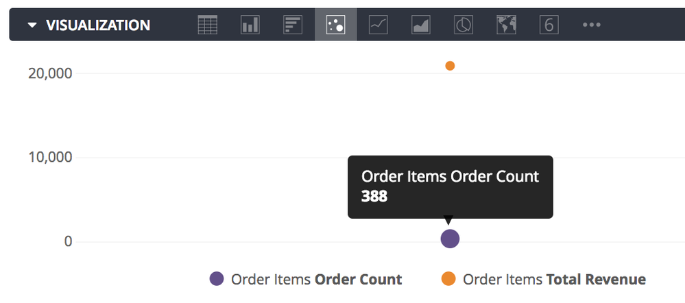
Some custom html and Liquid might help with some of the tooltip requests:
Here’s a simple example but could be expanded and made more fancy:
  measure: order_count {
    description: "A count of unique orders"
    label: "{% if users.age._is_selected %} Details {% else %} Order Count {% endif %}"
    type: count_distinct
    sql: ${order_id} ;;
    html: {% if users.age._is_selected %}
    <font color=red>Age:{{ users.age._rendered_value }}</font>, <font color=yellow>Order Count:{{ order_count._rendered_value }}</font>
    {% else %}
    {{ order_count._rendered_value }}
    {% endif %};;
  }
When Age is selected:
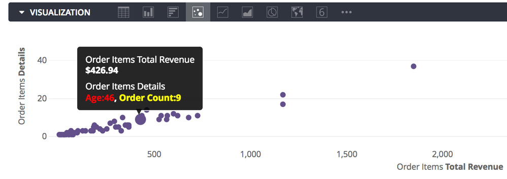
VS when it is not:
- Mark as New
- Bookmark
- Subscribe
- Mute
- Subscribe to RSS Feed
- Permalink
- Report Inappropriate Content
- Mark as New
- Bookmark
- Subscribe
- Mute
- Subscribe to RSS Feed
- Permalink
- Report Inappropriate Content
Great add here @shiggins! This is another good post as well to show other fields in the tooltip using our rendered_value type liquid reference.
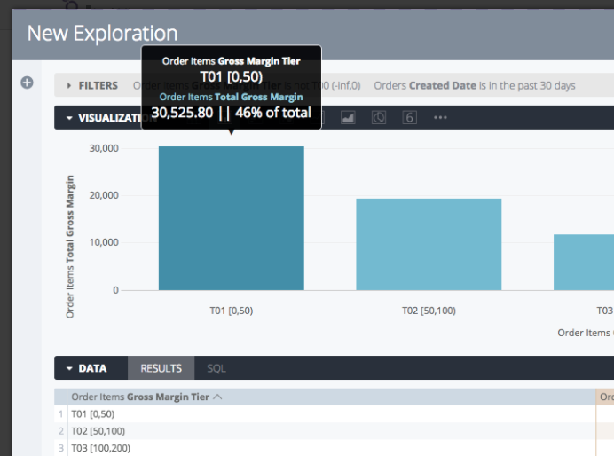
Here it is used to concatenate a percent of total value and the string “of total” to show a nice additional data point in the hover without affecting the ability to plot the original Total Gross Margin measure values
- Mark as New
- Bookmark
- Subscribe
- Mute
- Subscribe to RSS Feed
- Permalink
- Report Inappropriate Content
- Mark as New
- Bookmark
- Subscribe
- Mute
- Subscribe to RSS Feed
- Permalink
- Report Inappropriate Content
I also think it would be super powerful to be able to segment by color e.g. by adding a pivot dimension. Right now the scatter plot is very limited. Are there any changes on the roadmap?
- Mark as New
- Bookmark
- Subscribe
- Mute
- Subscribe to RSS Feed
- Permalink
- Report Inappropriate Content
- Mark as New
- Bookmark
- Subscribe
- Mute
- Subscribe to RSS Feed
- Permalink
- Report Inappropriate Content
Hey @Dimitri_Masin,
Tweaks to scatterplots including shading by color are not on our near-term roadmap right now, but I will let the product team know you would like to see this feature as well!
-Ryan
- Mark as New
- Bookmark
- Subscribe
- Mute
- Subscribe to RSS Feed
- Permalink
- Report Inappropriate Content
- Mark as New
- Bookmark
- Subscribe
- Mute
- Subscribe to RSS Feed
- Permalink
- Report Inappropriate Content
@rdunlavy - Huge +1,000 to being able to customize size, shape and color of scatter plots using dimensions or measures. This is a key feature in many other visualizations and is essential to getting the most out of a scatter plot - with color and shape to spot meaningful trends between different cohorts and with size to avoid letting low sample observations skew your interpretation of a data trend.
Please, please introduce this functionality soon!
Meanwhile, anyone have the best tips on preferred custom viz tools and options?
- Mark as New
- Bookmark
- Subscribe
- Mute
- Subscribe to RSS Feed
- Permalink
- Report Inappropriate Content
- Mark as New
- Bookmark
- Subscribe
- Mute
- Subscribe to RSS Feed
- Permalink
- Report Inappropriate Content
@rdunlavy - +1, We really want to see the improvements (segment by color using dimension, and custom size to spots) on Scatterplots.
- Mark as New
- Bookmark
- Subscribe
- Mute
- Subscribe to RSS Feed
- Permalink
- Report Inappropriate Content
- Mark as New
- Bookmark
- Subscribe
- Mute
- Subscribe to RSS Feed
- Permalink
- Report Inappropriate Content
I agree with @scaldwell and @mpopuri ; these are key components of a functional scatterplot. They are defined by the two+ measures and the ways to segment the view with color, size and shape. Until scatterplot has this functionality, there really isn’t much we can do with this plot option.
- Mark as New
- Bookmark
- Subscribe
- Mute
- Subscribe to RSS Feed
- Permalink
- Report Inappropriate Content
- Mark as New
- Bookmark
- Subscribe
- Mute
- Subscribe to RSS Feed
- Permalink
- Report Inappropriate Content
Hey @Dimitri_Masin, @scaldwell, @mpopuri and @Falreign,
In Looker 5.18, as part of the Enhanced Visualizations labs feature, the coloring of points will be possible in scatterplots. This can be done multiple measures or pivots. See below for an example, and be sure to check out the full 5.18 release notes!
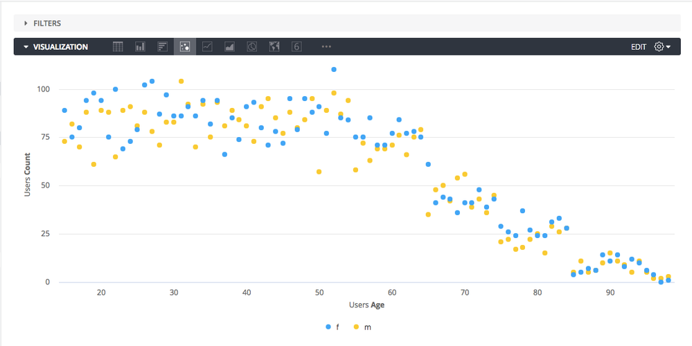
As for adjusting the size on scatterplots, I have pass all of your feedback on to the product team. Cheers!
- Mark as New
- Bookmark
- Subscribe
- Mute
- Subscribe to RSS Feed
- Permalink
- Report Inappropriate Content
- Mark as New
- Bookmark
- Subscribe
- Mute
- Subscribe to RSS Feed
- Permalink
- Report Inappropriate Content
Oh, I see! Yes colors is the big one so I am glad to see it is here.
Thank you for this!
-JLV
- Mark as New
- Bookmark
- Subscribe
- Mute
- Subscribe to RSS Feed
- Permalink
- Report Inappropriate Content
- Mark as New
- Bookmark
- Subscribe
- Mute
- Subscribe to RSS Feed
- Permalink
- Report Inappropriate Content
@rdunlavy - This isn’t a true scatterplot. A scatterplot graphs a mark for each individual record (no aggregation) on two particular values - these are typically both measures that won’t be aggregated. If looker needs to treat both as a dimension value to do this effectively that’s fine, but the Y axis should be another continuous value plotted against age, with the same number of dots as there are User Count for each matching value of age and second dimension.
What looker calls a scatterplot is just a line graph without a line. It’s not very useful.
Also, shape and size are equally important in this kind of data mining exploration. I would really like to see this functionality get better. Please add full scatterplot functionality to Looker.
- Mark as New
- Bookmark
- Subscribe
- Mute
- Subscribe to RSS Feed
- Permalink
- Report Inappropriate Content
- Mark as New
- Bookmark
- Subscribe
- Mute
- Subscribe to RSS Feed
- Permalink
- Report Inappropriate Content
+1 for a fully functional scatterplot. I agree with @scaldwell that this isn’t a true scatterplot.
For example, I want to measure # of incidents worked vs an escalation rate by teams. So my x- axis is # of incident, y-axis esclation rate, and the dots represent each team. The teams should be individually colored - so each dots is correlated is a value from a dimension within LookML. I don’t believe this is an option in Looker currently.
- Mark as New
- Bookmark
- Subscribe
- Mute
- Subscribe to RSS Feed
- Permalink
- Report Inappropriate Content
- Mark as New
- Bookmark
- Subscribe
- Mute
- Subscribe to RSS Feed
- Permalink
- Report Inappropriate Content
Hey @dan_geneczko,
Good news! When using the Enhanced Visualizations labs feature it’s now possible to create scatterplots with various coloring for each series, or dimension value.
- Mark as New
- Bookmark
- Subscribe
- Mute
- Subscribe to RSS Feed
- Permalink
- Report Inappropriate Content
- Mark as New
- Bookmark
- Subscribe
- Mute
- Subscribe to RSS Feed
- Permalink
- Report Inappropriate Content
Hi @rachel_johnson , I was able to control the size of the “bubbles” (great), but couldn’t figure out how to use the dimension as a series (in a simple two-measures, one dimension case)… Any tips?
- Mark as New
- Bookmark
- Subscribe
- Mute
- Subscribe to RSS Feed
- Permalink
- Report Inappropriate Content
- Mark as New
- Bookmark
- Subscribe
- Mute
- Subscribe to RSS Feed
- Permalink
- Report Inappropriate Content
Hey @Milan_Veverka,
Pivoting on the dimension will allow for a new series for each dimension value!
- Mark as New
- Bookmark
- Subscribe
- Mute
- Subscribe to RSS Feed
- Permalink
- Report Inappropriate Content
- Mark as New
- Bookmark
- Subscribe
- Mute
- Subscribe to RSS Feed
- Permalink
- Report Inappropriate Content
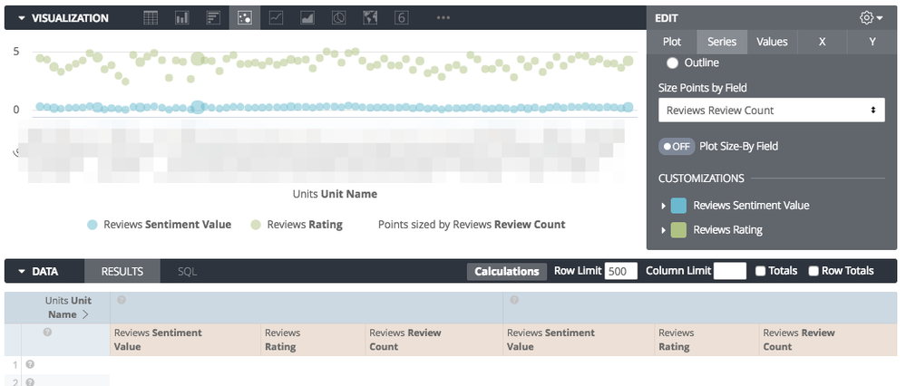
@rachel_johnson thanks - I’m still struggling though. Looks to me like a dimension cannot be “hidden” and “pivoted” at the same time. So I guess I can have either/or - each dot represents one (hidden) dimension value, but I can’t color-code them, or I can have color-coded dots for each dimension value, but not in a two-measure scatter plot. Is there a trick I’m still missing or is it just not possible yet? Thanks!!!
Got this:
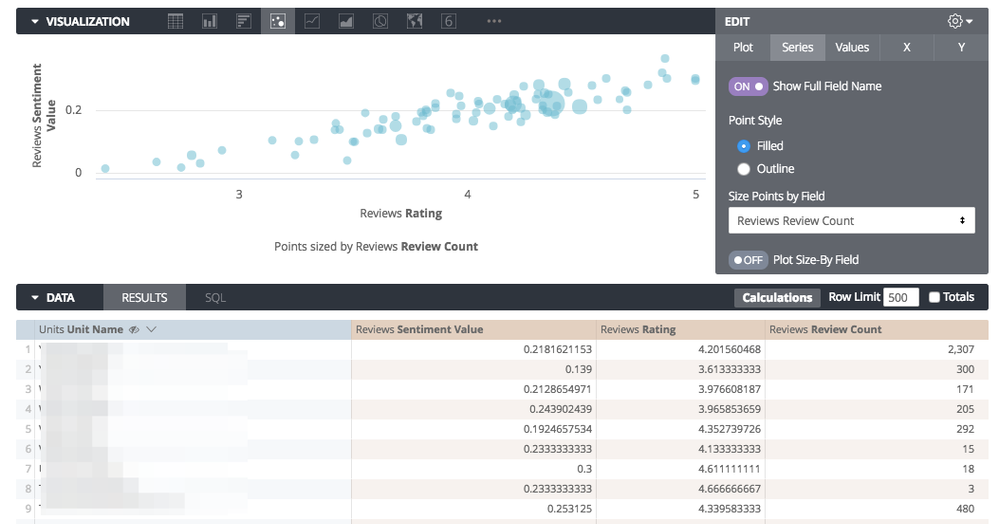
And the desired output is to have different color of each dot, plus legend (all based on the “Unit Name” dimension)
- Mark as New
- Bookmark
- Subscribe
- Mute
- Subscribe to RSS Feed
- Permalink
- Report Inappropriate Content
- Mark as New
- Bookmark
- Subscribe
- Mute
- Subscribe to RSS Feed
- Permalink
- Report Inappropriate Content
(Pivoting on the dimension as you suggested gets me this):
-
access grant
4 -
actionhub
9 -
actions
14 -
Admin
4 -
alert
29 -
Analytics
2 -
Analytics Block
33 -
Analytics General
1 -
API
12 -
bar
10 -
bestpractice
4 -
BigQuery
7 -
blocks
1 -
boards
4 -
Bug
168 -
cache
2 -
case
2 -
chart
17 -
cohort
1 -
connection
5 -
connection database
1 -
content access
1 -
content-validator
2 -
count
6 -
custom dimension
9 -
custom field
19 -
custom measure
8 -
customdimension
9 -
Dashboards
749 -
Data
5 -
Data Sources
4 -
data tab
4 -
Database
5 -
datagroup
2 -
date-formatting
14 -
dates
18 -
derivedtable
1 -
develop
1 -
development
3 -
dimension
17 -
done
8 -
download
19 -
downloading
9 -
drill-down
1 -
drilling
30 -
dynamic
1 -
embed
10 -
Errors
13 -
etl
1 -
explore
84 -
Explores
133 -
extends
1 -
feature-requests
10 -
filed
3 -
filter
245 -
Filtering
115 -
folders
4 -
formatting
19 -
git
2 -
Google Data Studio
1 -
Google Sheets
2 -
googlesheets
7 -
graph
9 -
group by
6 -
html
12 -
i__looker
1 -
imported project
2 -
Integrations
4 -
javascript
2 -
join
2 -
json
3 -
label
4 -
line chart
17 -
link
5 -
links
3 -
liquid
22 -
Looker
5 -
Looker Studio Pro
46 -
LookerStudio
7 -
lookml
169 -
lookml dashboard
15 -
looks
187 -
manage projects
1 -
map
30 -
map_layer
5 -
Marketplace
4 -
measure
4 -
Memorystore for Memcached
1 -
merge
14 -
model
3 -
modeling
2 -
multiple select
1 -
ndt
1 -
parameter
11 -
pdf
8 -
pdt
8 -
performance
7 -
periodoverperiod
5 -
permission management
1 -
persistence
1 -
pivot
21 -
postgresql
1 -
python
2 -
pythonsdk
2 -
Query
3 -
quickstart
4 -
ReactJS
1 -
redshift
4 -
release
16 -
rendering
8 -
Reporting
10 -
schedule
51 -
schedule delivery
5 -
sdk
1 -
Security
4 -
sharing
2 -
singlevalue
16 -
snowflake
3 -
sql
24 -
SSO
1 -
stacked chart
10 -
system activity
5 -
table chart
16 -
tablecalcs
144 -
Tile
12 -
time
8 -
time zone
3 -
totals
13 -
Training
1 -
Ui
19 -
usage
4 -
user access management
3 -
user management
3 -
user-attributes
6 -
value_format
4 -
view
4 -
Views
4 -
visualizations
558 -
watch
1 -
webhook
2
- « Previous
- Next »

 Twitter