- Looker
- Looker Forums
- Exploring & Curating Data
- Highlight specific bars in a Bar chart of a pivote...
- Subscribe to RSS Feed
- Mark Topic as New
- Mark Topic as Read
- Float this Topic for Current User
- Bookmark
- Subscribe
- Mute
- Printer Friendly Page
- Mark as New
- Bookmark
- Subscribe
- Mute
- Subscribe to RSS Feed
- Permalink
- Report Inappropriate Content
- Mark as New
- Bookmark
- Subscribe
- Mute
- Subscribe to RSS Feed
- Permalink
- Report Inappropriate Content
Hello Looker Community,
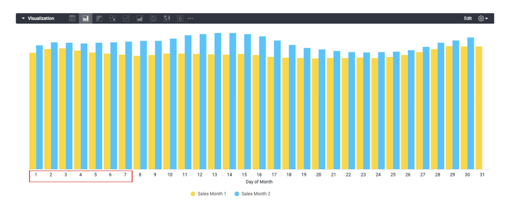
I would like to highlight a subset of my data, specifically I would like to bring attention to the first 7 days of each month.
The dataset is comprised of daily sales of two months, with 2 dimensions [Month, Day of Month] and 1 measure [Sales] and the table is pivoted by month.
I would like to some how visually separate the data based on the value of day of month dimension

Thank you,
- Labels:
-
chart
-
visualizations
- Mark as New
- Bookmark
- Subscribe
- Mute
- Subscribe to RSS Feed
- Permalink
- Report Inappropriate Content
- Mark as New
- Bookmark
- Subscribe
- Mute
- Subscribe to RSS Feed
- Permalink
- Report Inappropriate Content
I sometimes do that to highlight the last period for a monthly/weekly graph. You would have to split the measure into two table calculations. One would be when Day of Month < 8, and the other when it’s >= 8. Make sure that the falsy value for each is a NULL.
This works for one series though. If you have more than one then you’d have to do the same thing for each of the series/pivots. I haven’t found any other way to do that
- Mark as New
- Bookmark
- Subscribe
- Mute
- Subscribe to RSS Feed
- Permalink
- Report Inappropriate Content
- Mark as New
- Bookmark
- Subscribe
- Mute
- Subscribe to RSS Feed
- Permalink
- Report Inappropriate Content
Thank you Dawid, I appreciate your help.
The solution would work if I wasn’t using those values to calculate a moving average. I wish looker would allow you to adjust the color attribute to communicate more information in each chart.
-
access grant
4 -
actionhub
9 -
actions
14 -
Admin
4 -
alert
29 -
Analytics
2 -
Analytics Block
33 -
Analytics General
1 -
API
12 -
bar
10 -
bestpractice
4 -
BigQuery
7 -
blocks
1 -
boards
4 -
Bug
168 -
cache
2 -
case
2 -
chart
17 -
cohort
1 -
connection
5 -
connection database
1 -
content access
1 -
content-validator
2 -
count
6 -
custom dimension
9 -
custom field
19 -
custom measure
8 -
customdimension
9 -
Dashboards
749 -
Data
5 -
Data Sources
4 -
data tab
4 -
Database
5 -
datagroup
2 -
date-formatting
14 -
dates
18 -
derivedtable
1 -
develop
1 -
development
3 -
dimension
17 -
done
8 -
download
19 -
downloading
9 -
drill-down
1 -
drilling
30 -
dynamic
1 -
embed
10 -
Errors
13 -
etl
1 -
explore
84 -
Explores
133 -
extends
1 -
feature-requests
10 -
filed
3 -
filter
245 -
Filtering
115 -
folders
4 -
formatting
19 -
git
2 -
Google Data Studio
1 -
Google Sheets
2 -
googlesheets
7 -
graph
9 -
group by
6 -
html
12 -
i__looker
1 -
imported project
2 -
Integrations
4 -
javascript
2 -
join
2 -
json
3 -
label
4 -
line chart
17 -
link
5 -
links
3 -
liquid
22 -
Looker
5 -
Looker Studio Pro
46 -
LookerStudio
7 -
lookml
169 -
lookml dashboard
15 -
looks
187 -
manage projects
1 -
map
30 -
map_layer
5 -
Marketplace
4 -
measure
4 -
Memorystore for Memcached
1 -
merge
14 -
model
3 -
modeling
2 -
multiple select
1 -
ndt
1 -
parameter
11 -
pdf
8 -
pdt
8 -
performance
7 -
periodoverperiod
5 -
permission management
1 -
persistence
1 -
pivot
21 -
postgresql
1 -
python
2 -
pythonsdk
2 -
Query
3 -
quickstart
4 -
ReactJS
1 -
redshift
4 -
release
16 -
rendering
8 -
Reporting
10 -
schedule
51 -
schedule delivery
5 -
sdk
1 -
Security
4 -
sharing
2 -
singlevalue
16 -
snowflake
3 -
sql
24 -
SSO
1 -
stacked chart
10 -
system activity
5 -
table chart
16 -
tablecalcs
144 -
Tile
12 -
time
8 -
time zone
3 -
totals
13 -
Training
1 -
Ui
19 -
usage
4 -
user access management
3 -
user management
3 -
user-attributes
6 -
value_format
4 -
view
4 -
Views
4 -
visualizations
558 -
watch
1 -
webhook
2
- « Previous
- Next »

 Twitter